Greco: Postcards from Greece
Across six days on location in Mykonos in 2024 with a small team, I directed the key campaign stills and video, and shot the 35mm incidental film photographs for the launch campaign of the Greco collection, using the photographs in the campaign’s promotional postcards and as props for the still life shoot, while I also producing the 64pp launch magazine and building the collection’s logo and type system.
Cassandra Goad, 2025
Art Direction | Photography | Image Systems | Campaign Identity | Editorial Design | Print
A photographic language built from fleeting textures, found moments and sun-faded memories of Greece.
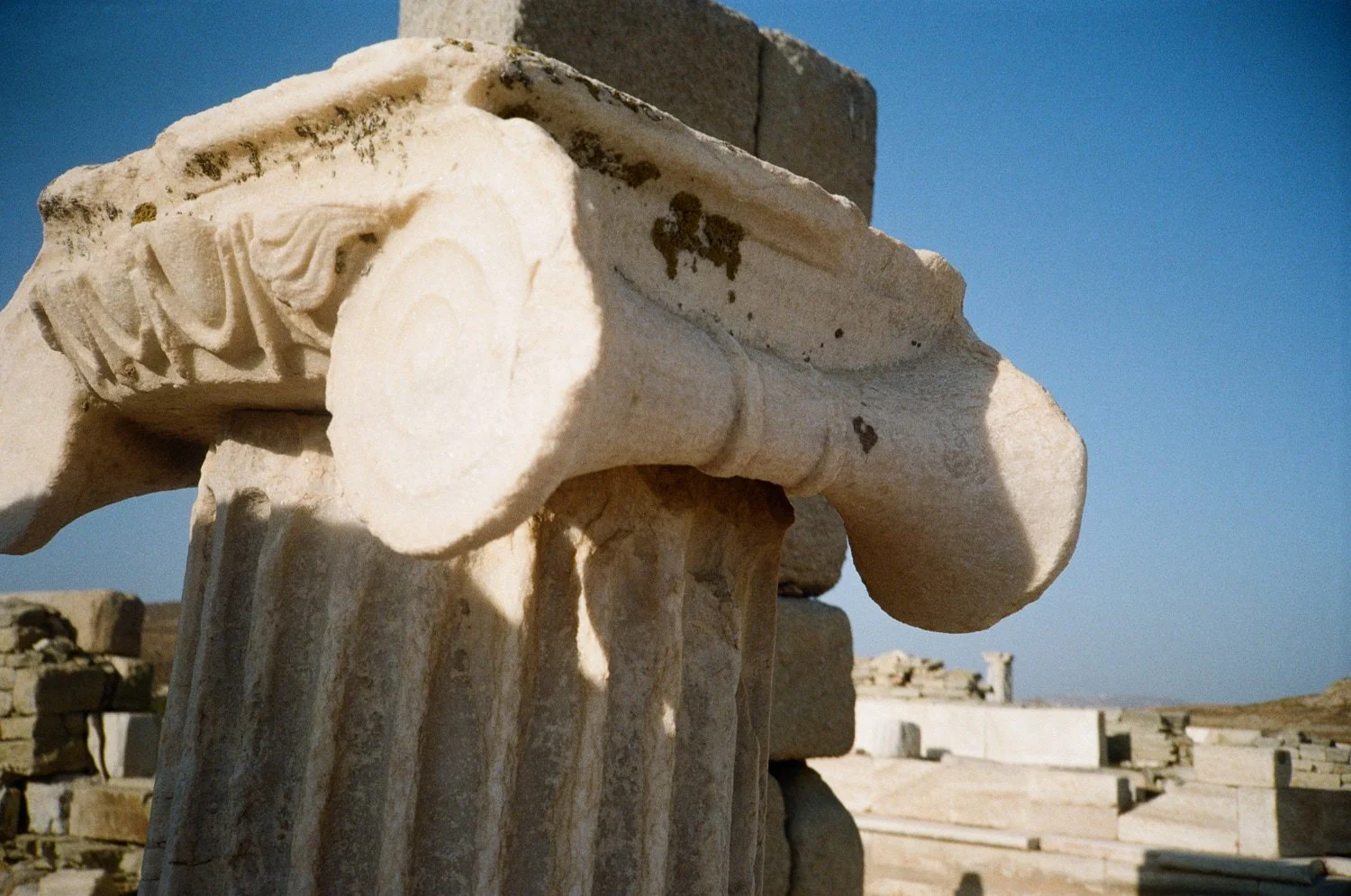
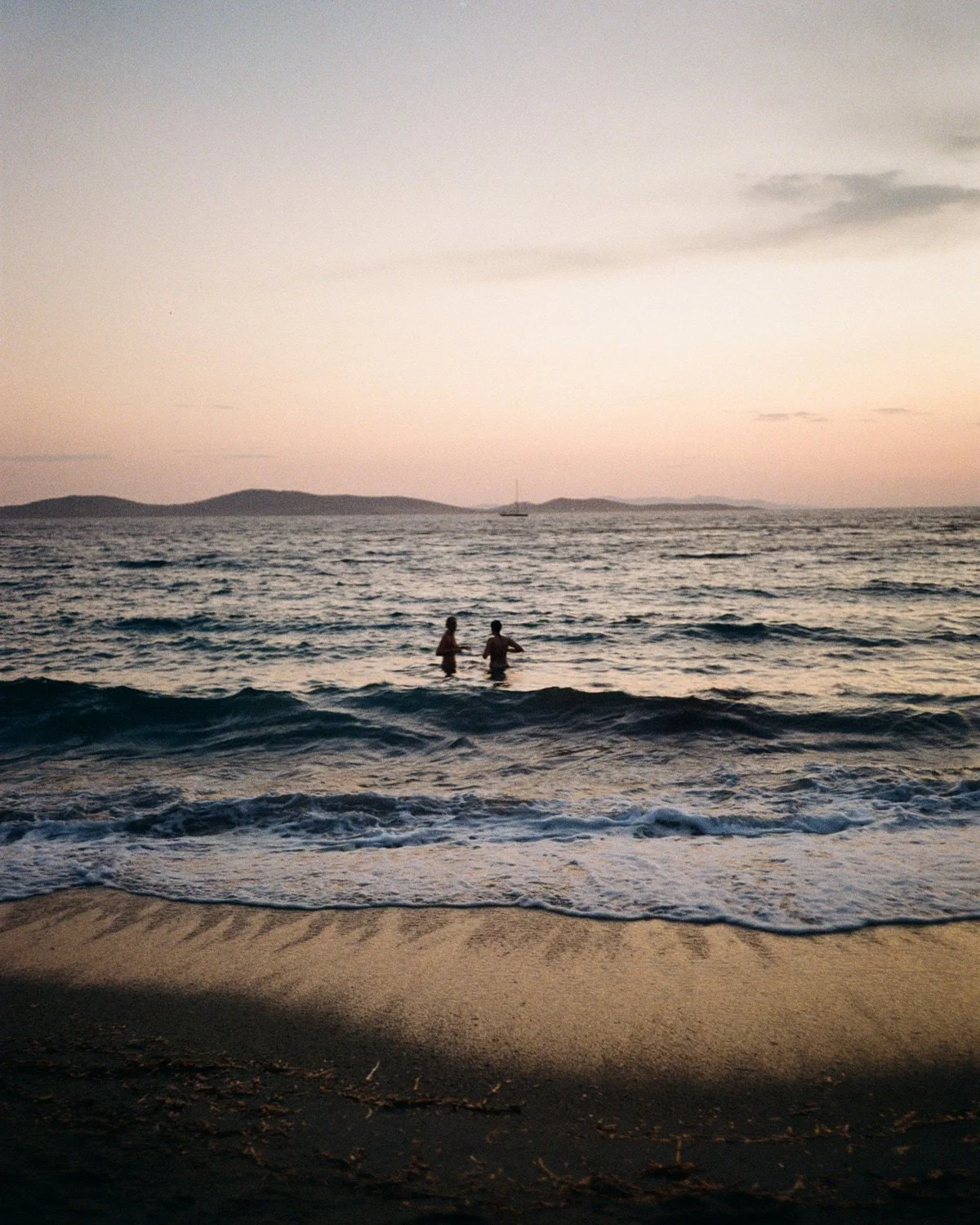
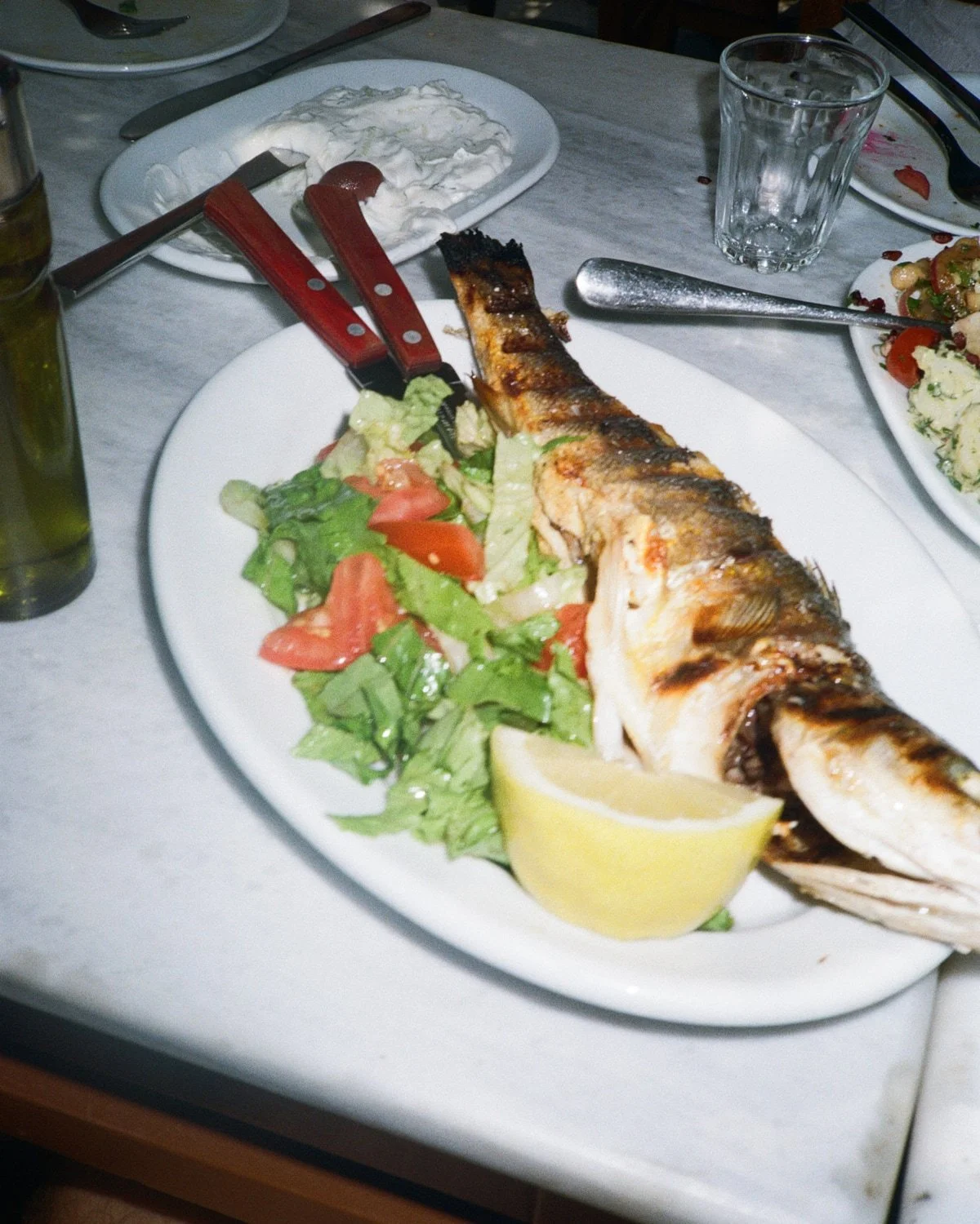
The images I shot had to carry across editorial, digital, print and retail, so I avoided anything that pinned them to a specific time or place. Shooting on a 35mm point-and-shoot meant I couldn’t over-direct a frame, so going against what I’d learnt at university, I shot into the light, with wonky horizons and awkward framing, drawn to the graphic shapes and textures formed by Greece’s light, nature and architecture.
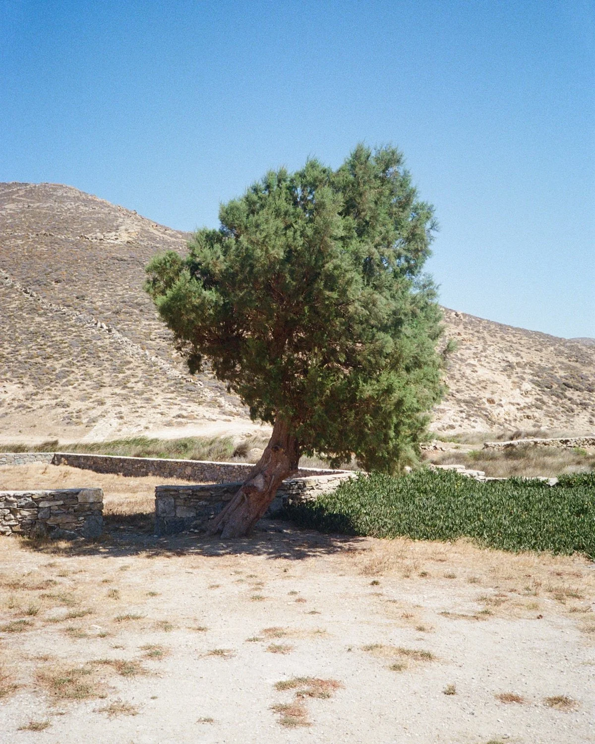
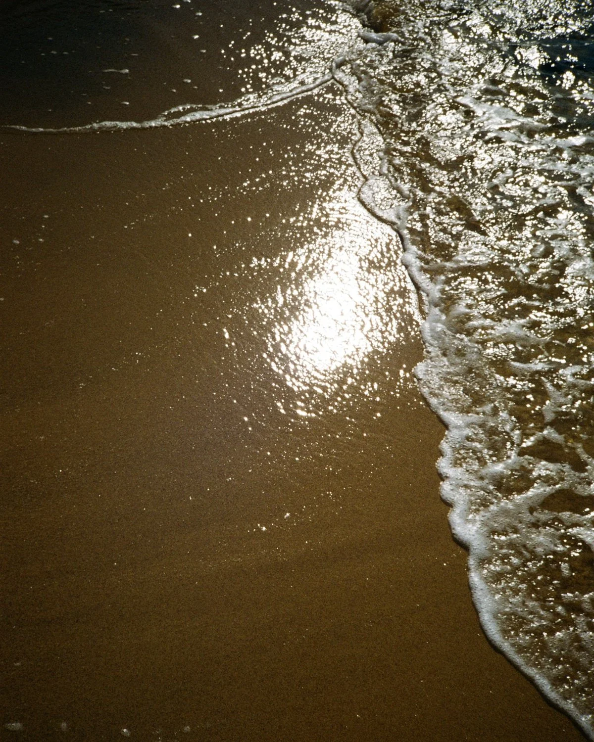
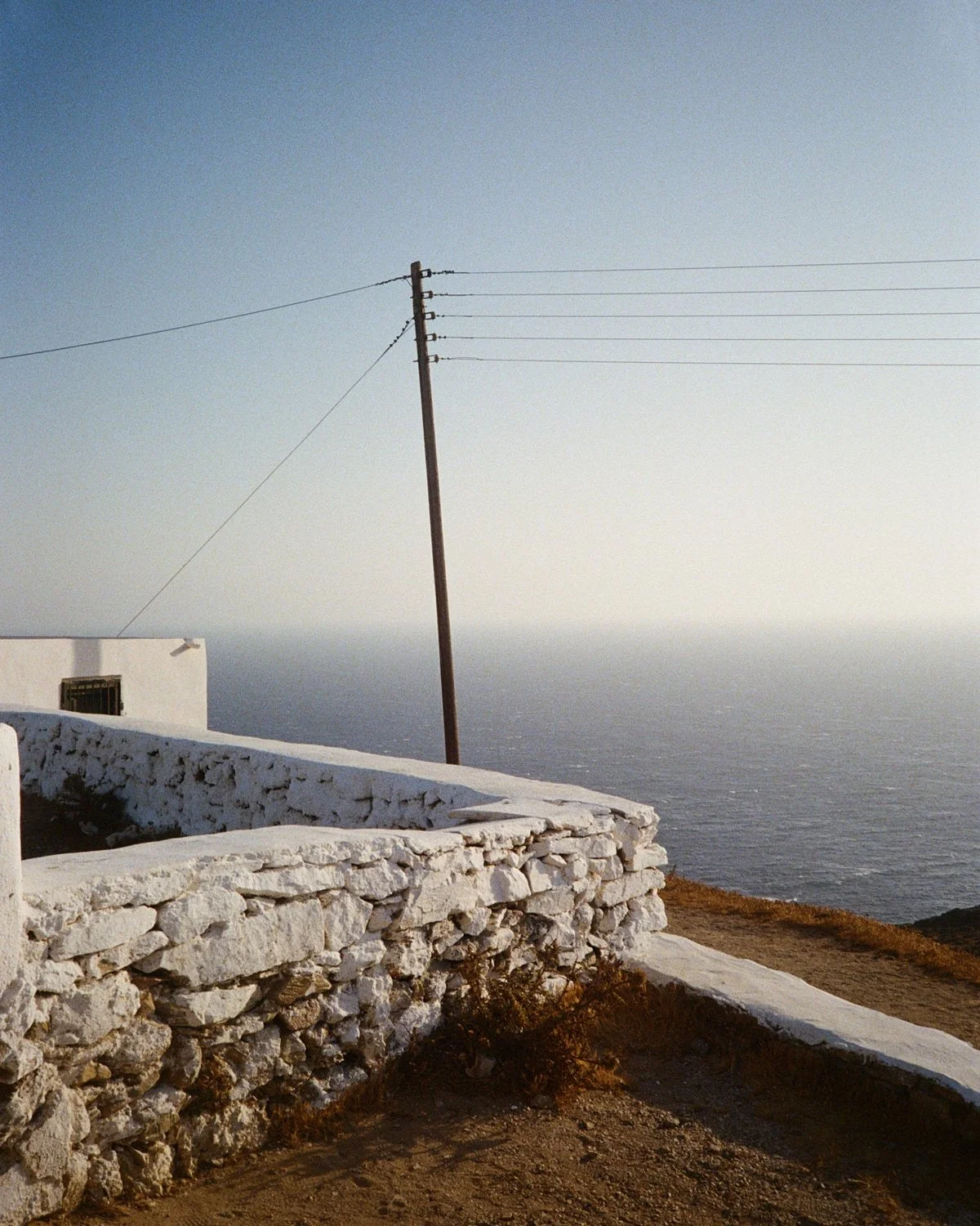
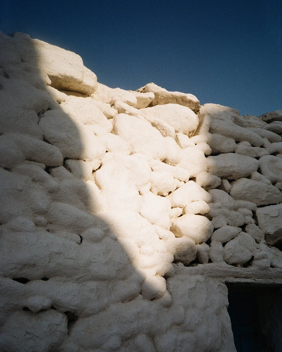
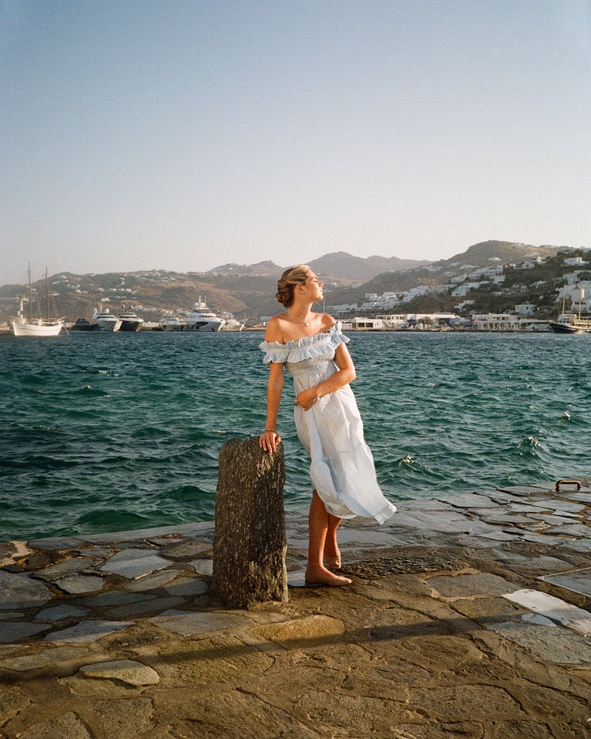
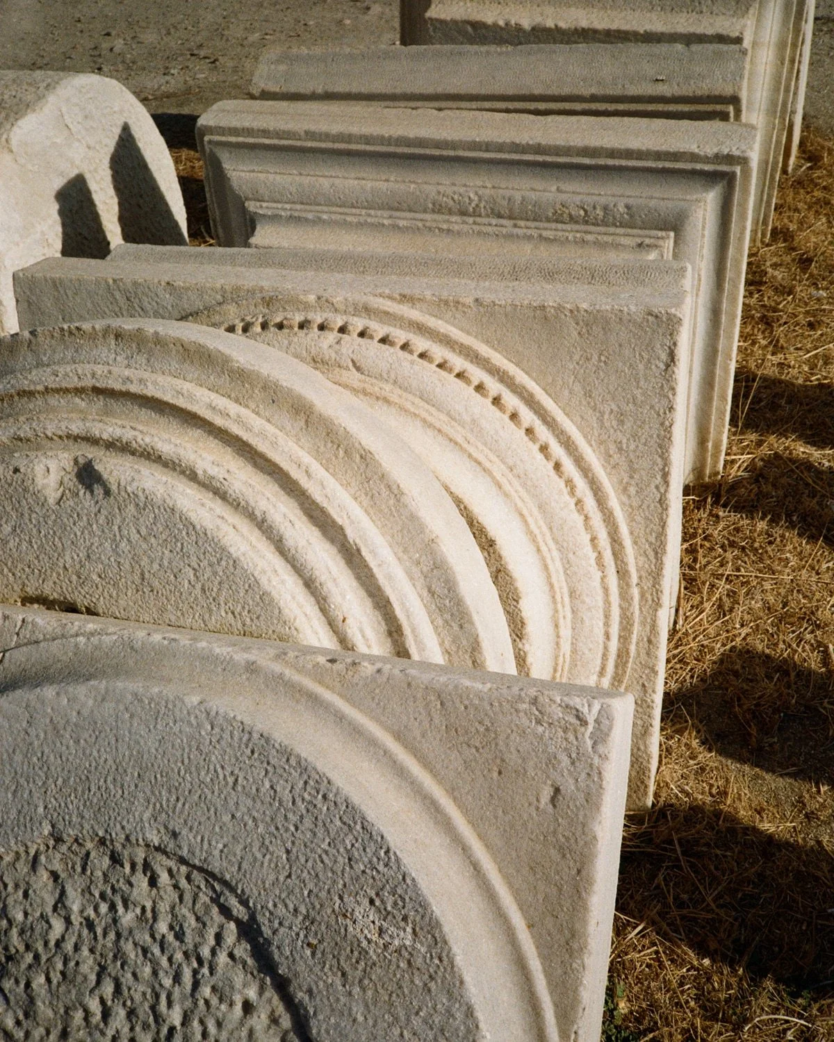
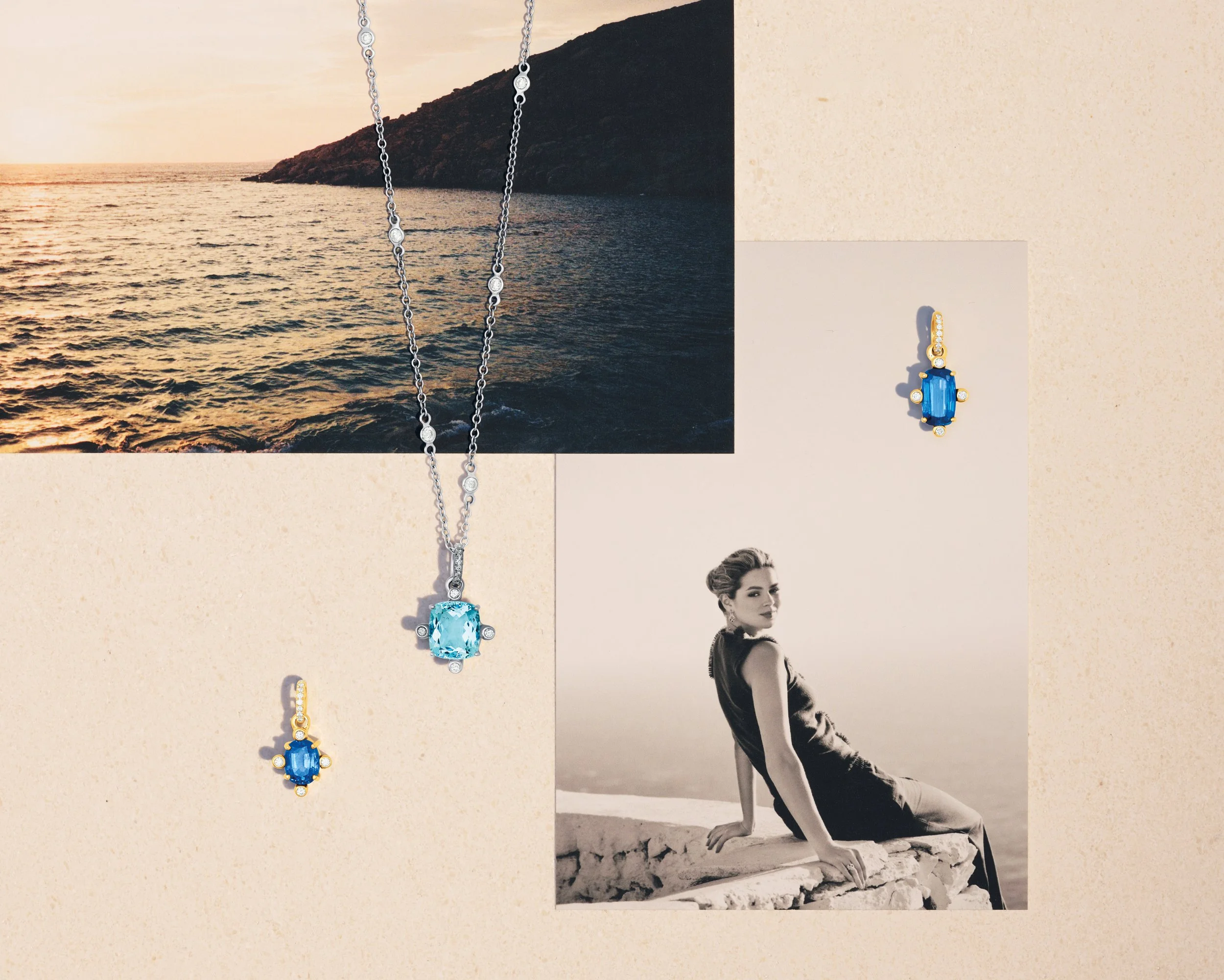
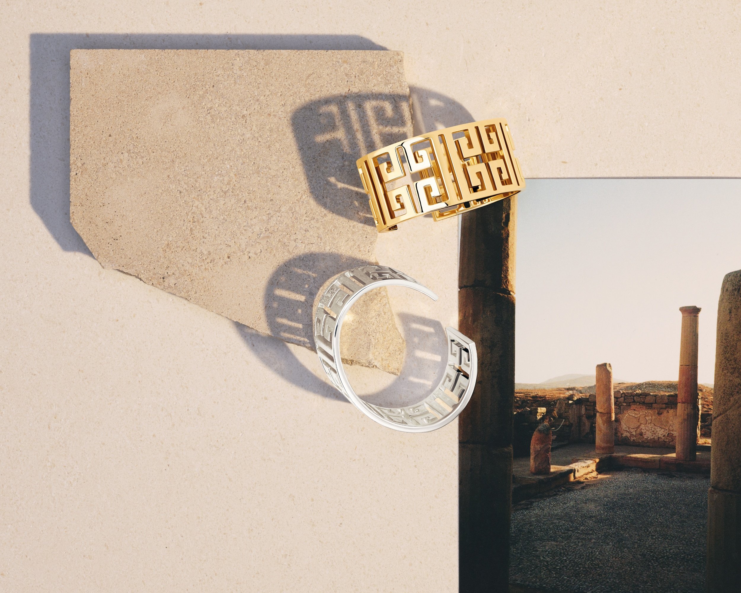
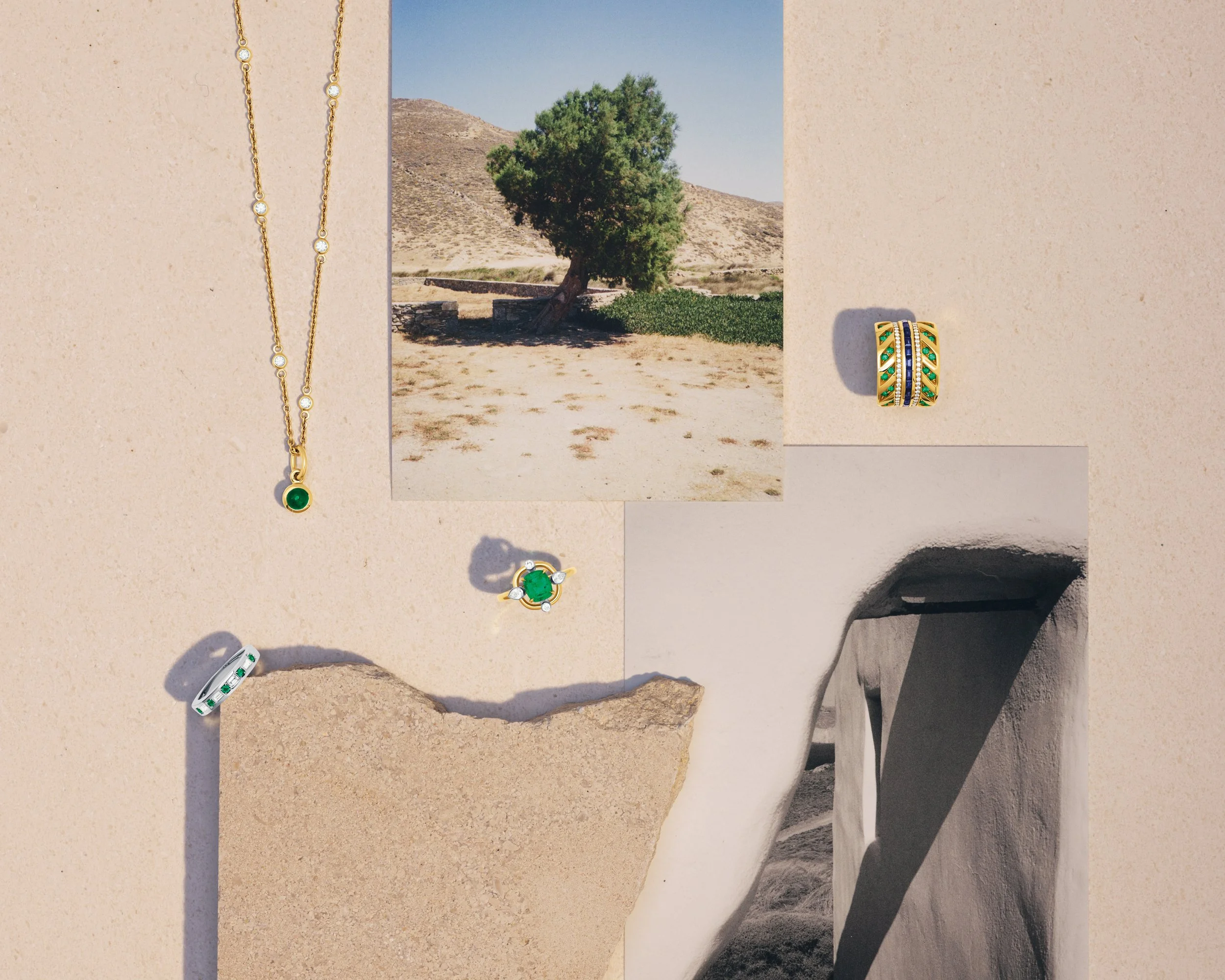
Prints served as props in the still life images, which were used throughout the Greco collection’s launch campaign.
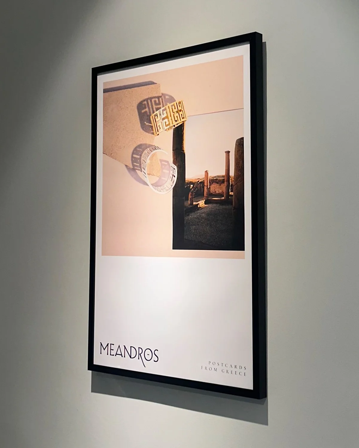
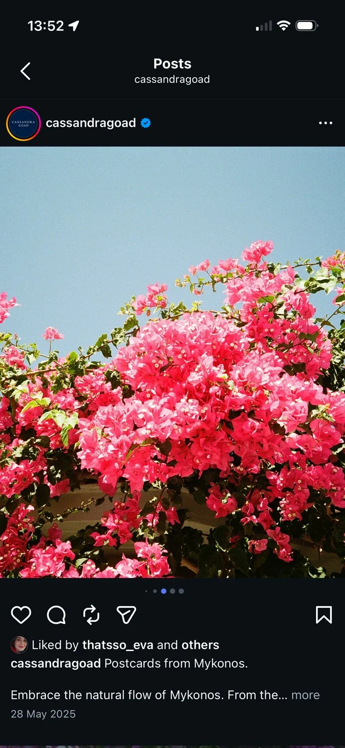
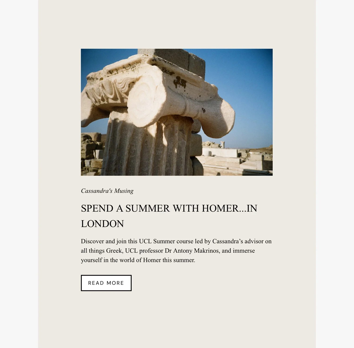
The photographs were also used across in-store visual merchandising, social media, email newsletters, blog posts, as well as the series of 16 promotional postcards and throughout the two-year collection’s annual catalogues and magazines.
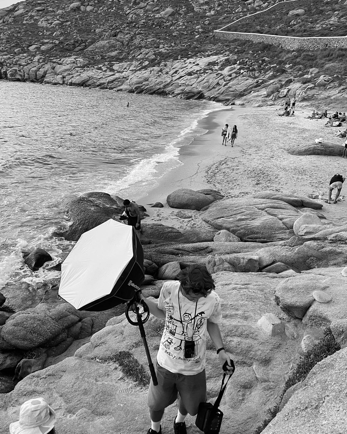
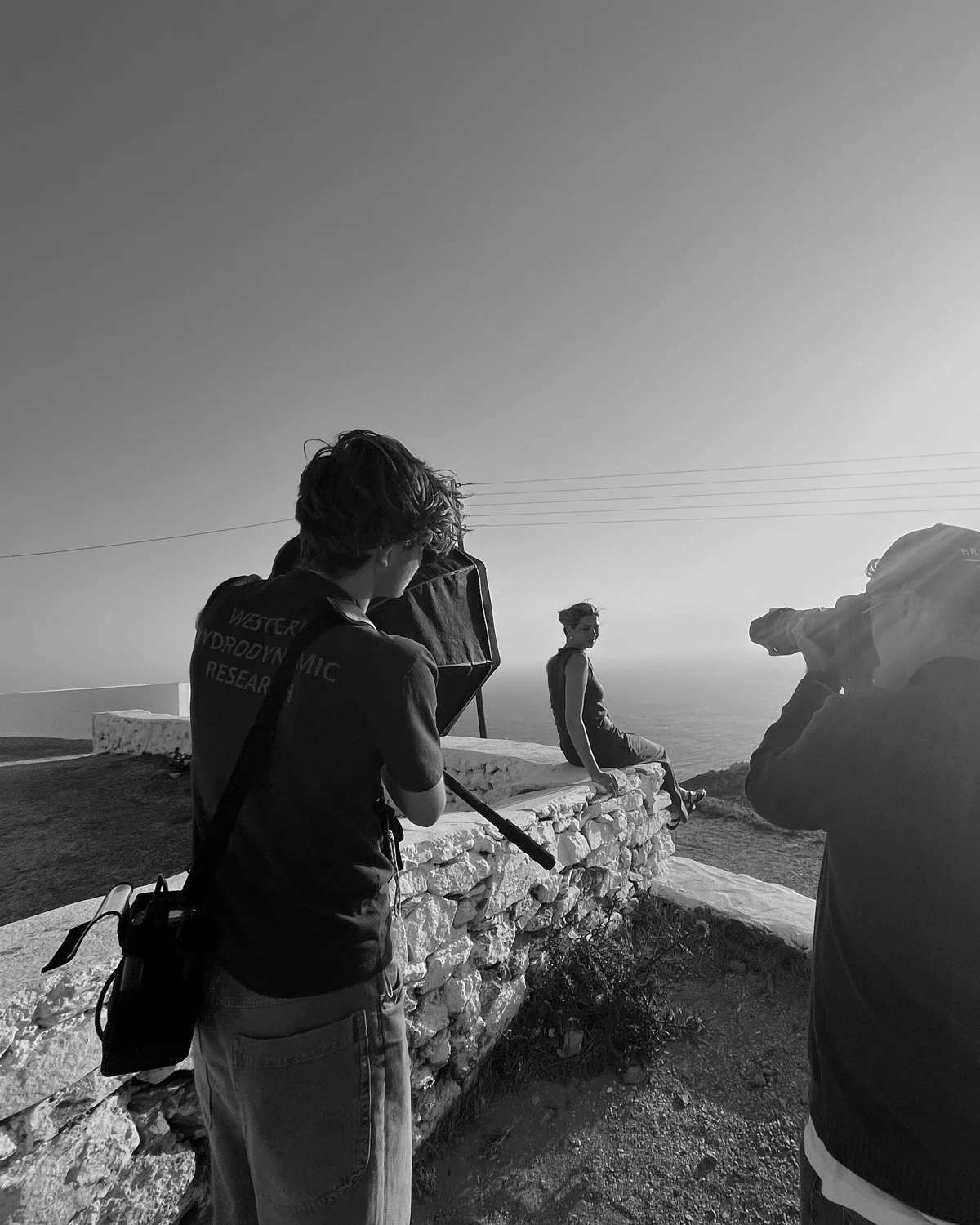
Shooting the film photographs alongside the lead photographer and videographer, meant they each worked towards the same narrative.
A logo and type system built to scale
I drew the campaign’s ‘Greco’ logo from Albertus, combining weights and sizes, stretching and reworking them, and building a small dash to sit inside the ‘O’.
From there, I made Albertus a secondary layer under Cassandra Goad’s Cormorant Garamond, building a full-scale design and type system, as well as drawing distinct logomarks for each of the collection’s new design names.
I then carefully stress-tested and built the system to function across editorial, email, physical signage, social media and more.

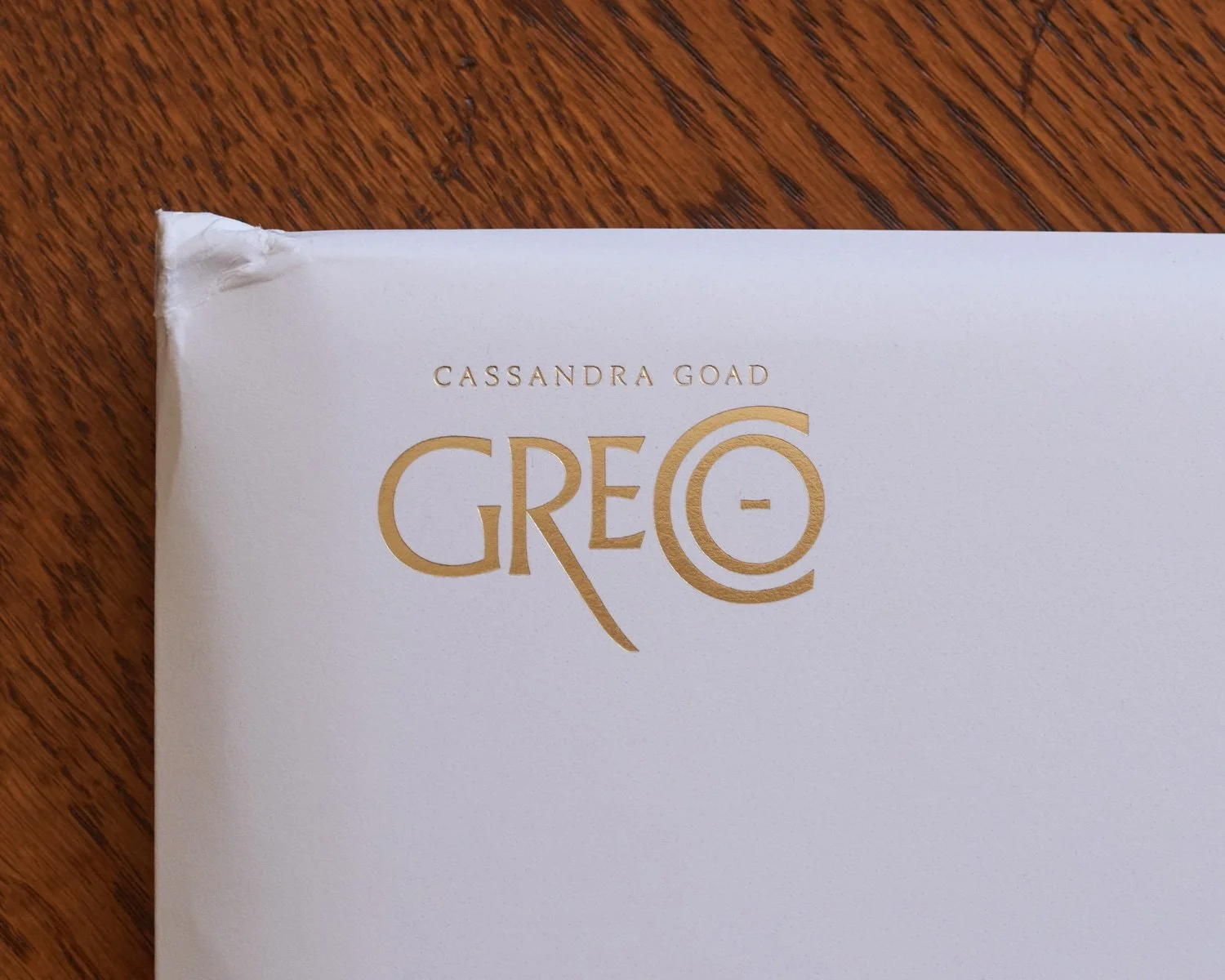
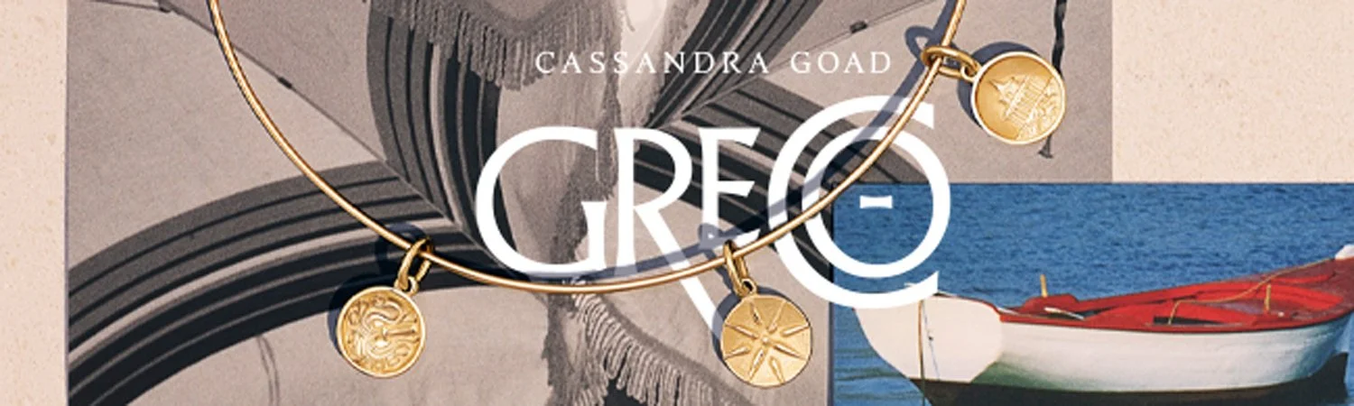
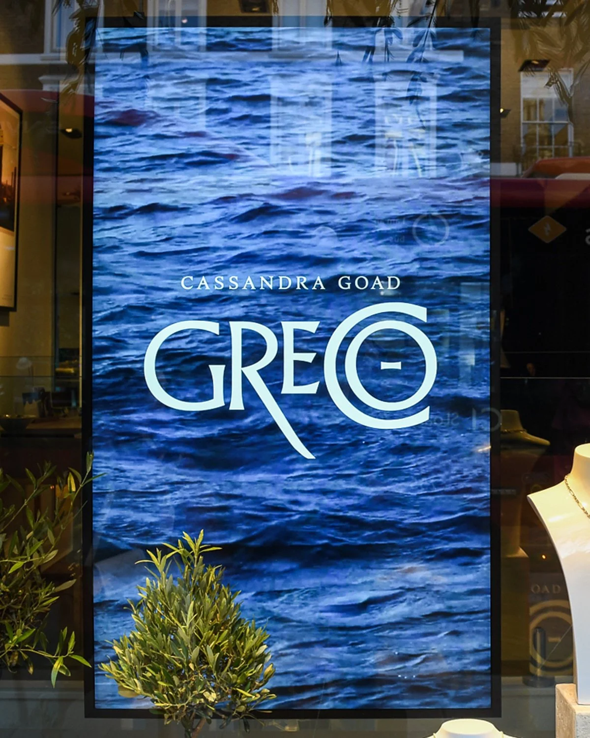
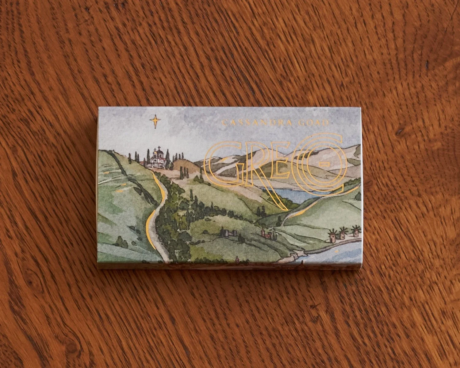
Featured on envelope for Magazine 2025 and Catalogue 2026, July 2025’s email signature, front window display at launch party, and promotional Christmas matchboxes.
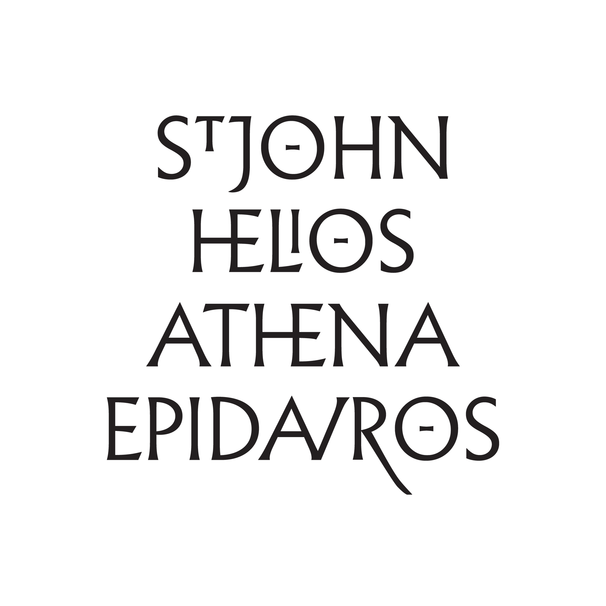
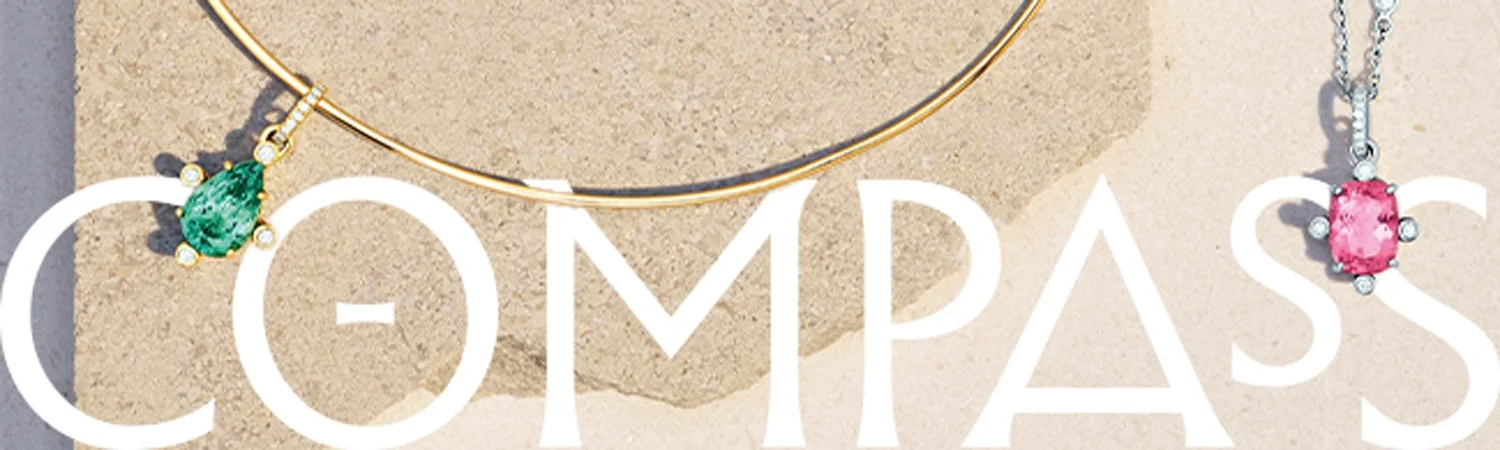
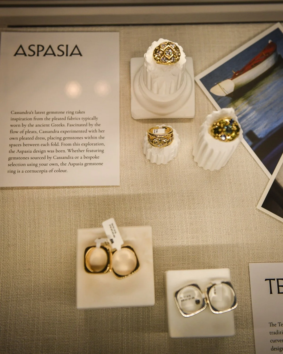
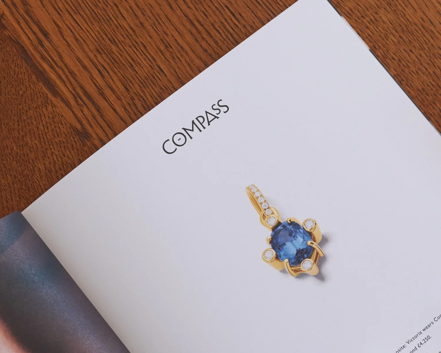
Design name logomarks were used in boutique displays, email signatures and throughout 2025’s magazine.
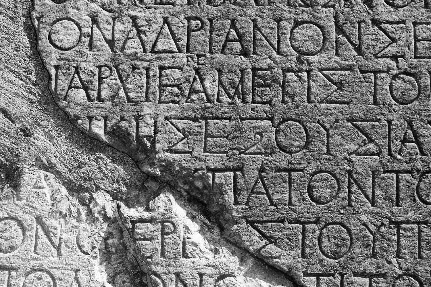
Albertus was the basis of Greco’s type concept because its subtle serifs and structured identity mimicked ancient Greek stone carvings.
Magazine 2025
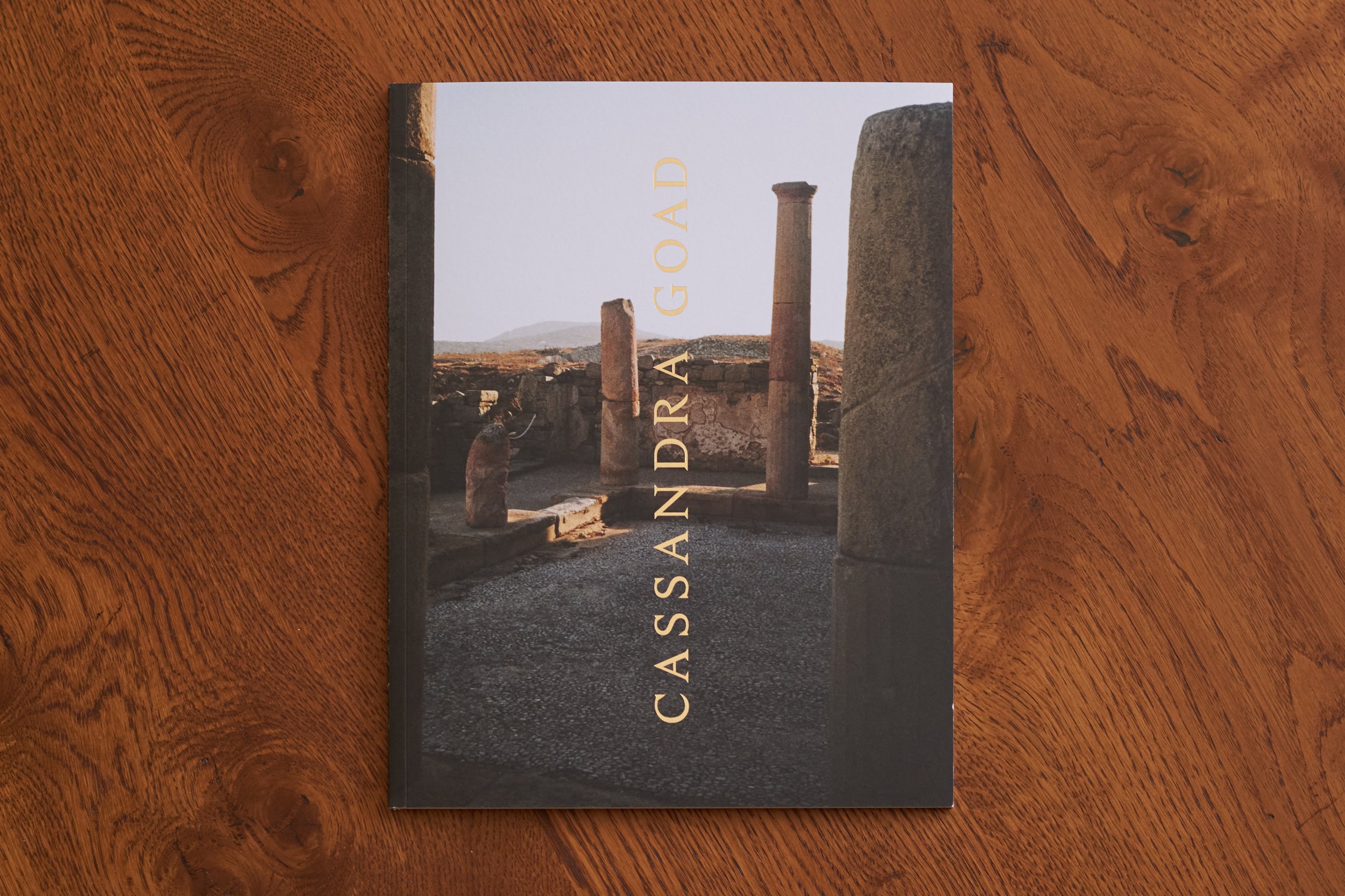
Print, 210mm by 270mm. Cover: UPM Fine 350gsm, 4pp. Text: Munken Polar Smooth Crisp White 150gsm, 64pp.
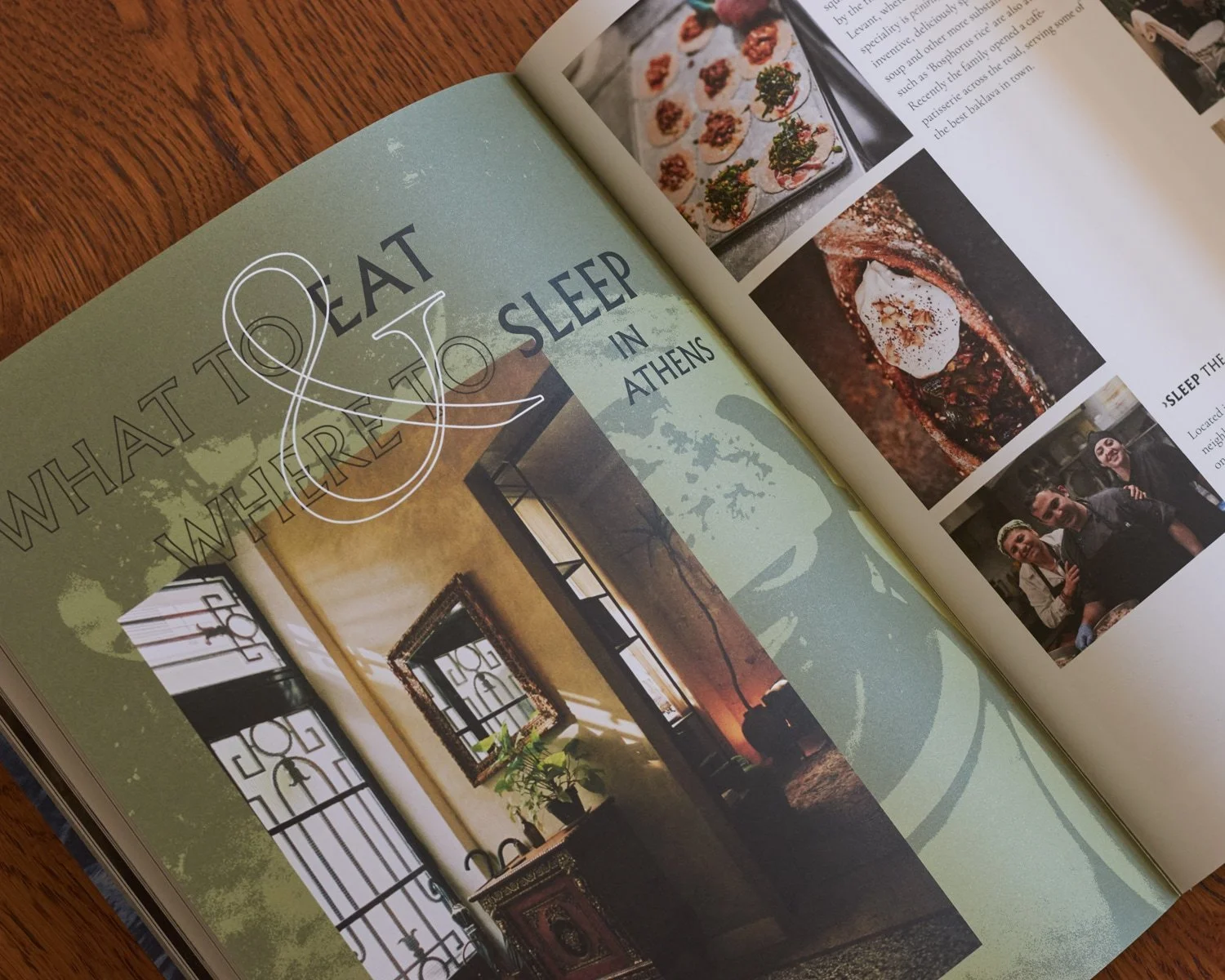
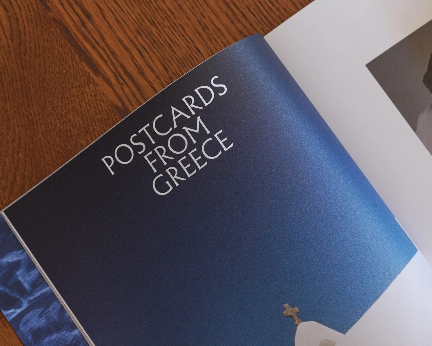
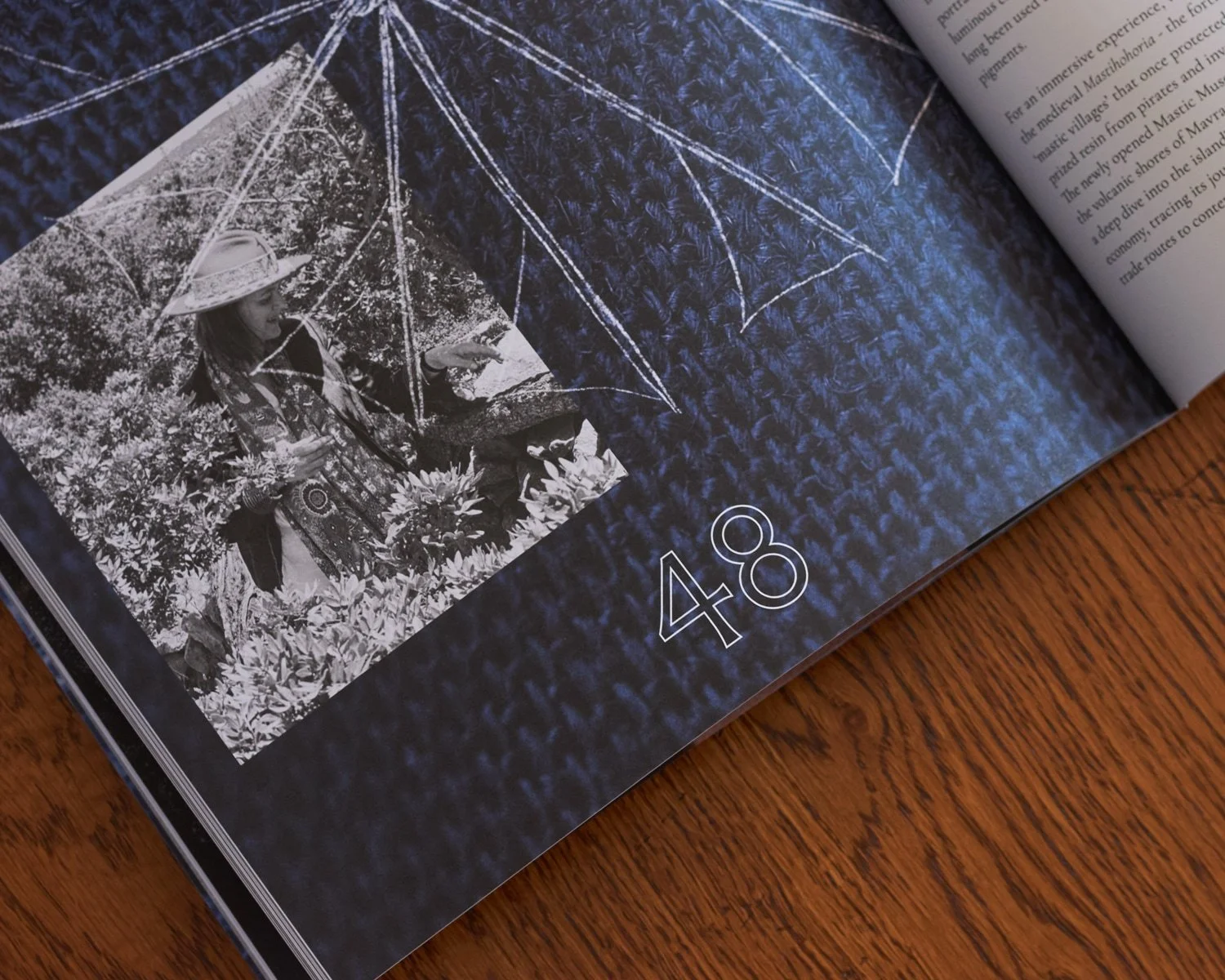
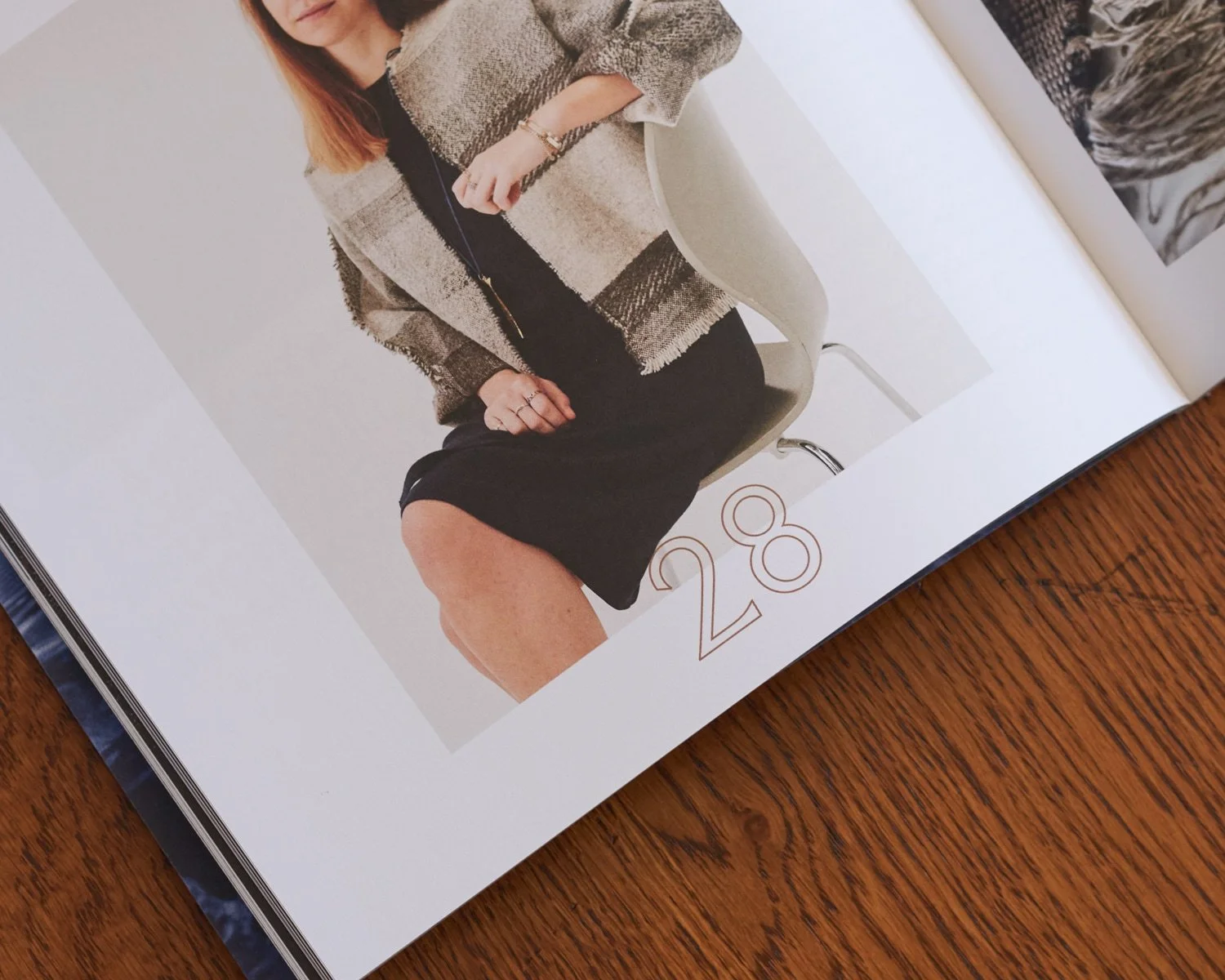
The type concept was incorporated into Magazine 2025’s page numbering and titles.
Bringing clients into the world of Greco
As part of my initial pitch for this launch campaign, I wanted the campaign to be something clients didn’t just observe, but also interact with.
So to bring the concept home, I designed a set of 16 postcards, around three quarters of which came from my own film photographs, with the rest from grainy edits of the key campaign stills. Marketing added the in-store mailing station and post box, which turned clients into part of the distribution.
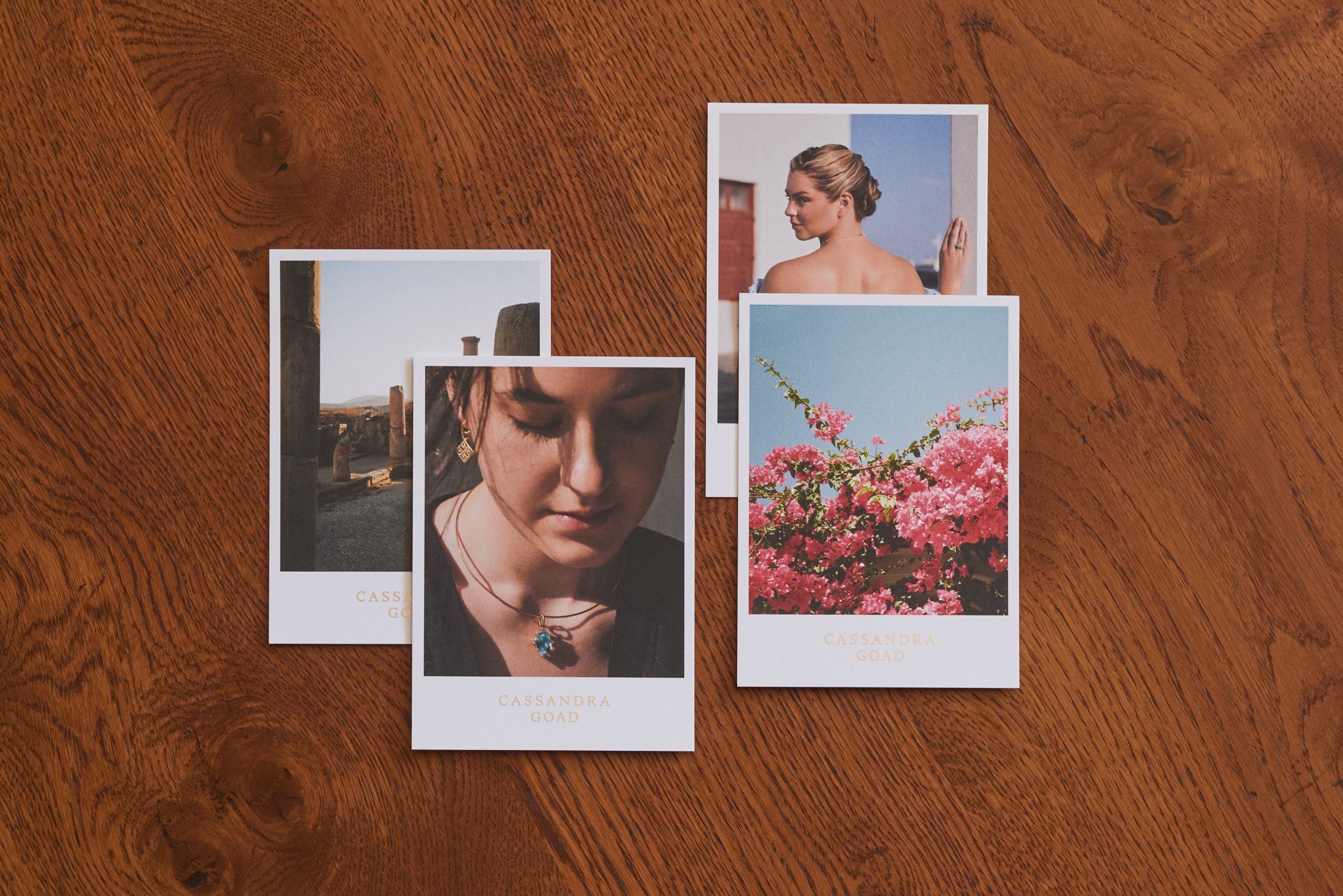
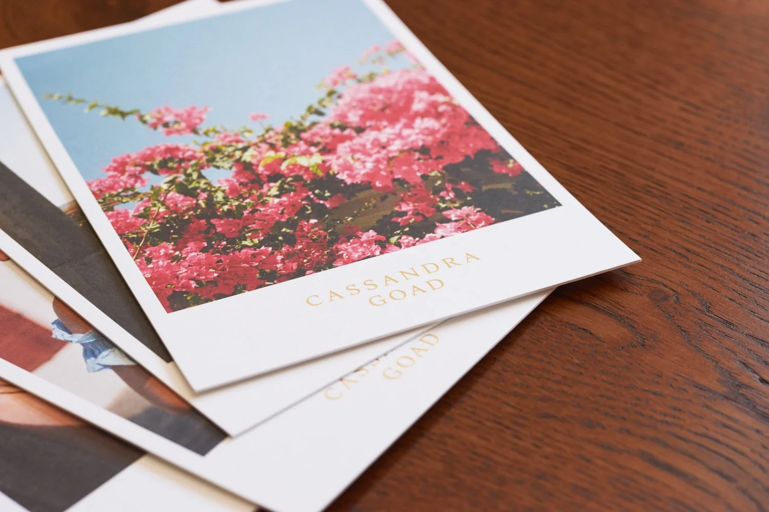
Print, 16 unique designs, 105mm by 148mm.
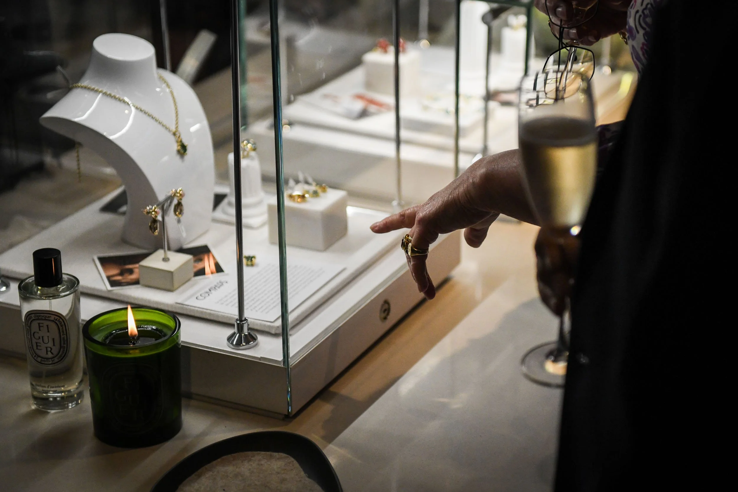
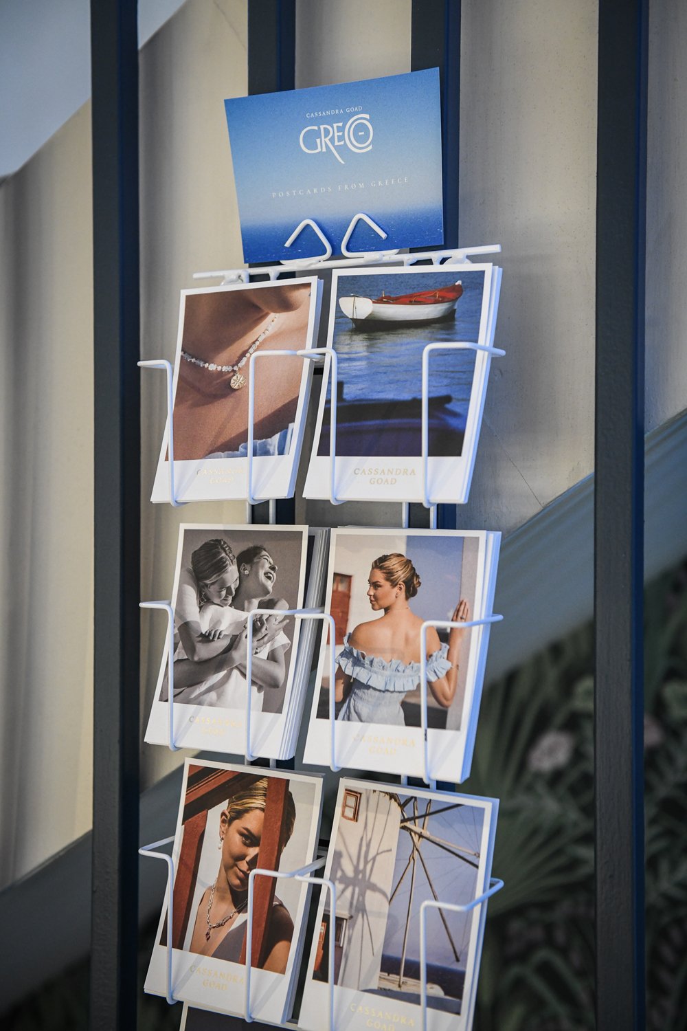
Postcards were displayed in jewellery cabinets and on in-store card stands throughout the launch campaign and, seen here, at the launch part in May.