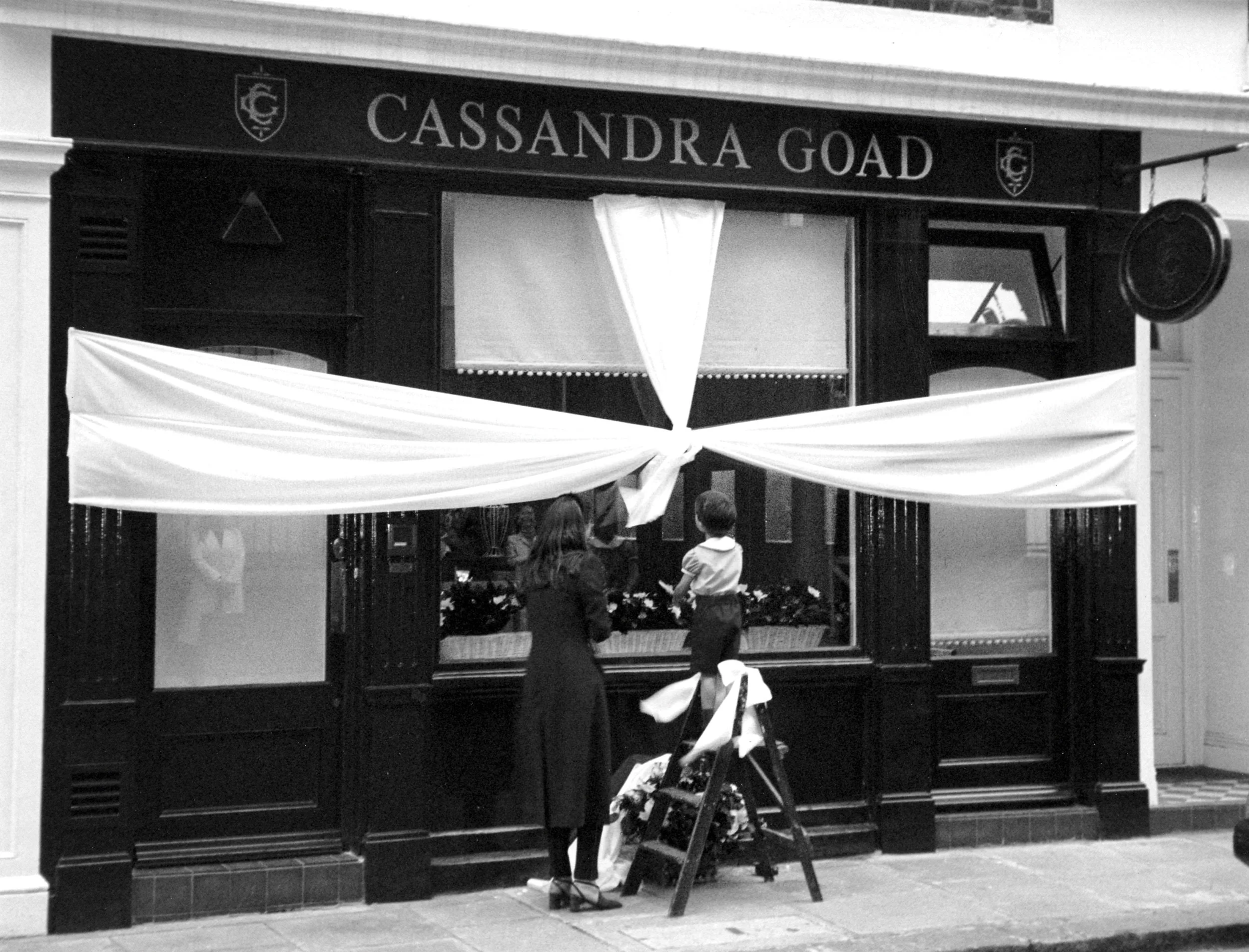
40 Years of Cassandra Goad
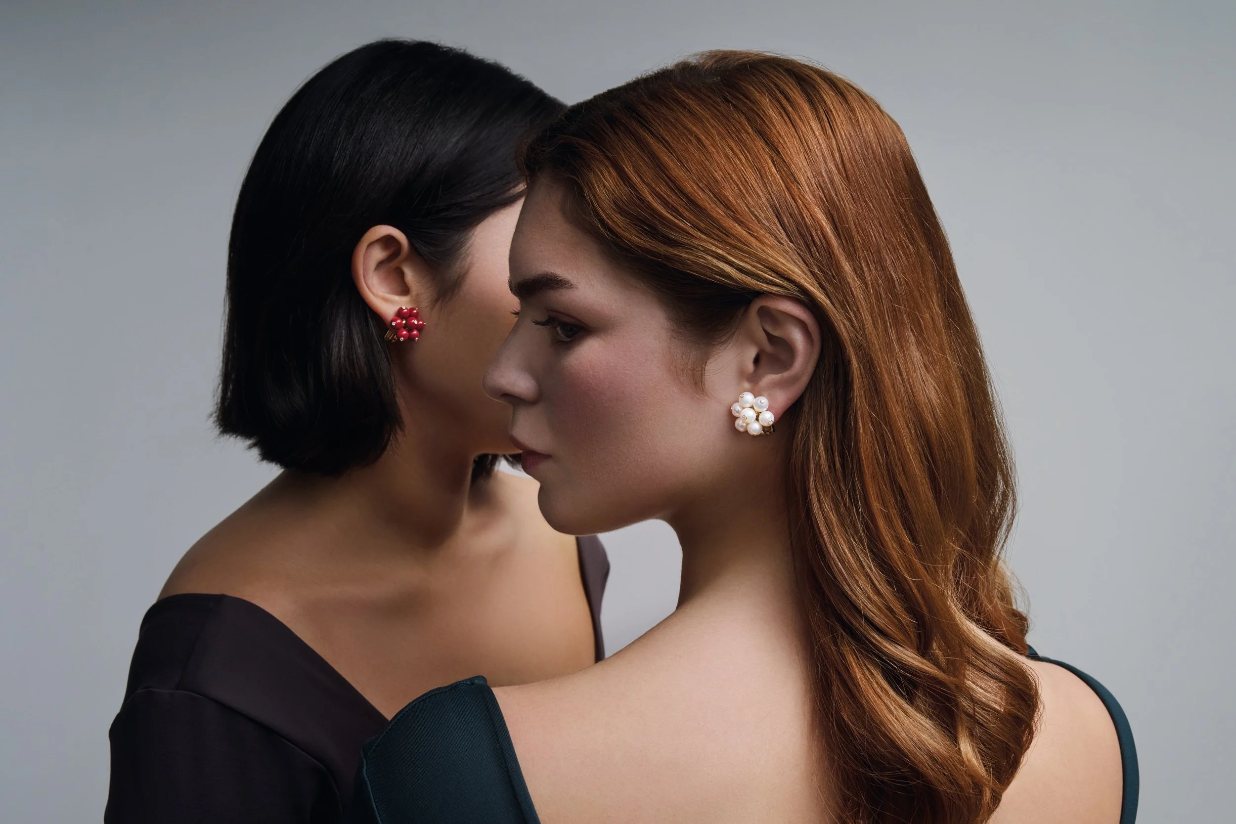
This year-long campaign ran extensively across print, digital and experiential touchpoints, and so the campaign photography I directed was done with versatility in mind. I drew the two logo marks, developed and art directed the brand video, while also designing and producing all of the campaign’s print material, from the 128pp catalogue down to the run of twelve Quote Pendant napkins for the VIP party held at Goldsmiths’ Hall.
Cassandra Goad, 2025
Art Direction | Campaign Identity | Editorial Design | Print | Experiential
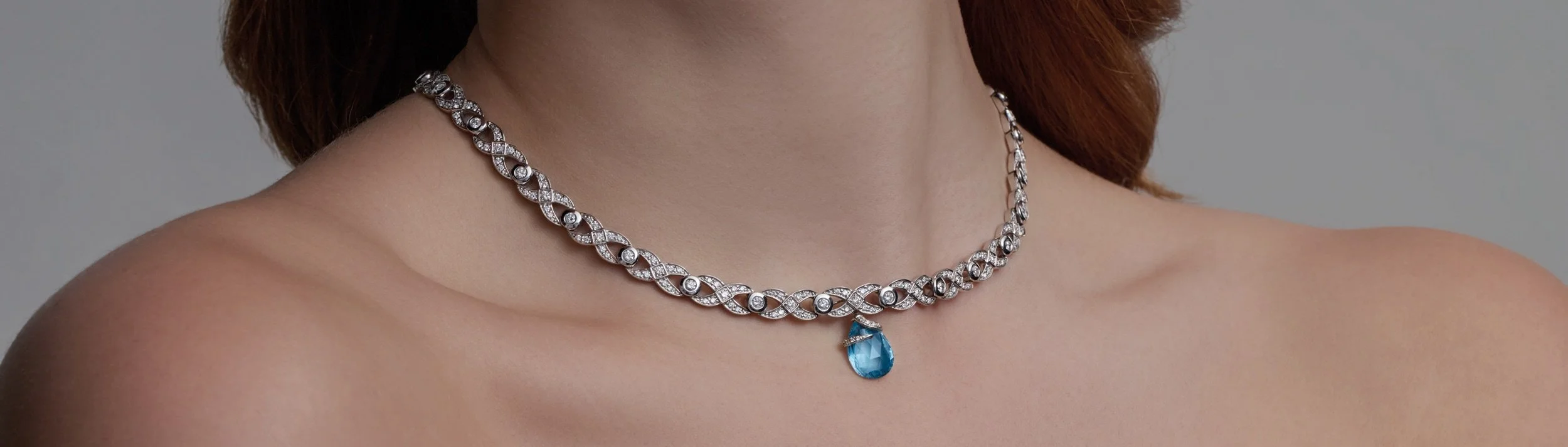
Found imagery brought authenticity, works in progress showed the process, while macro shots took you closer to the craft.
I developed and art directed a promotional brand video. Leading the narrative direction of the video, I focused on translating Cassandra’s eclectic inspirations and personal connections to each jewel into something visual. By drawing on the brand’s rich physical and printed archive I built sets and staged scenes that have more to say than words alone.
The simplified photographic language made launching from a small in-house team possible.
I checked every image as it came in against the retouching we could realistically do and the crops the placements would force, while directing posing and keeping compositions clear and free of props to allow the images to scale across often restrictive ecommerce and online ad formats.
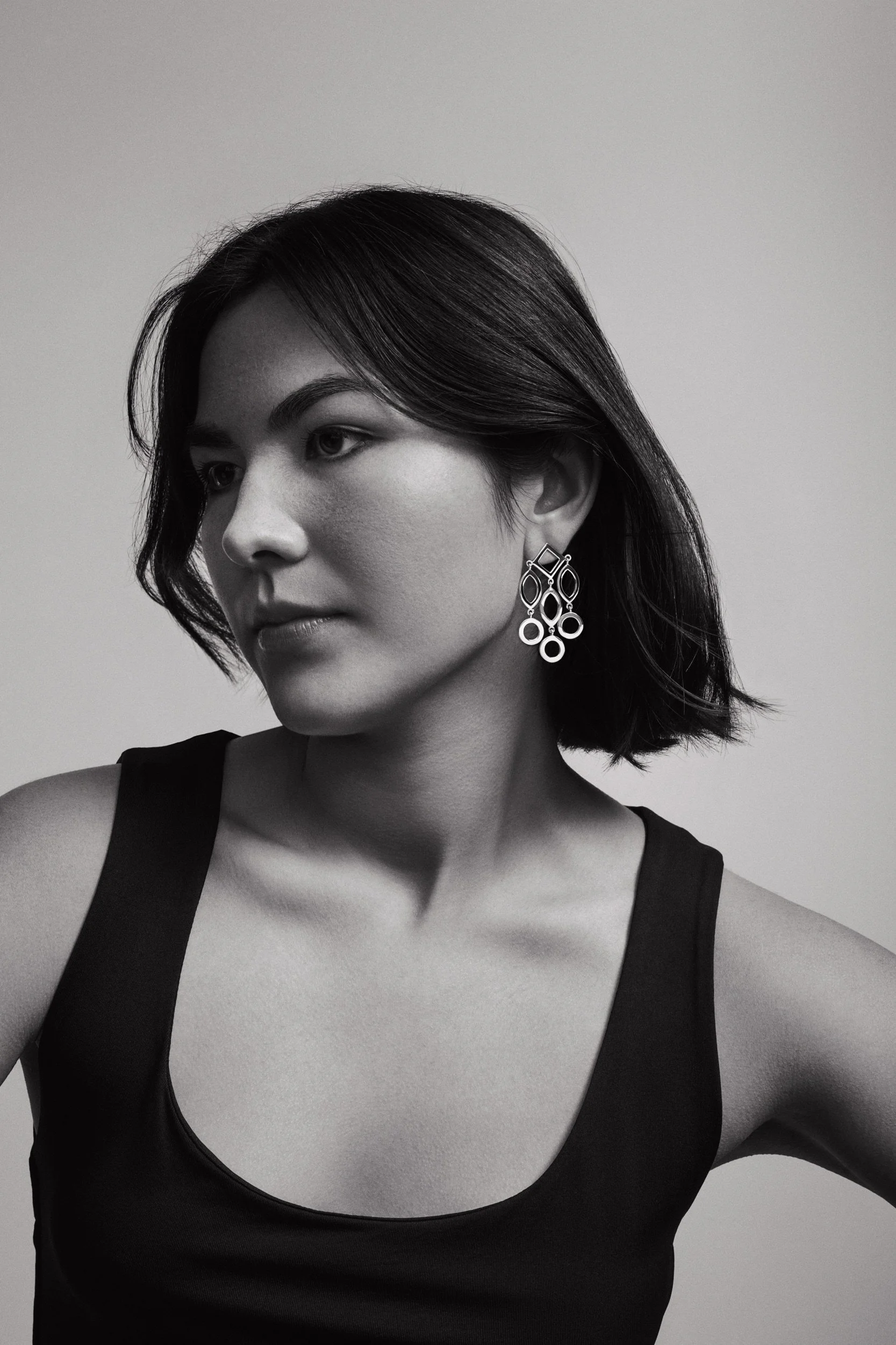
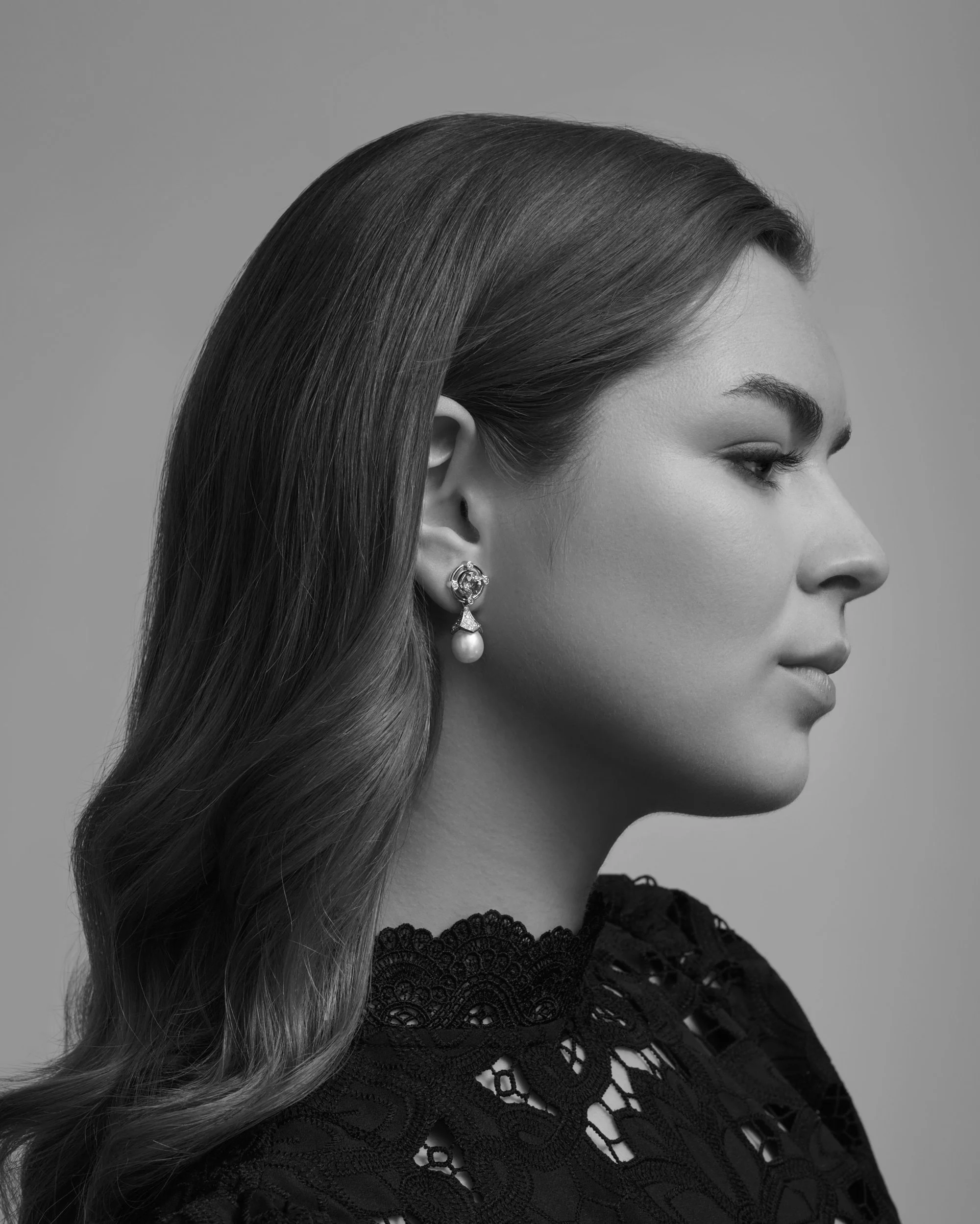

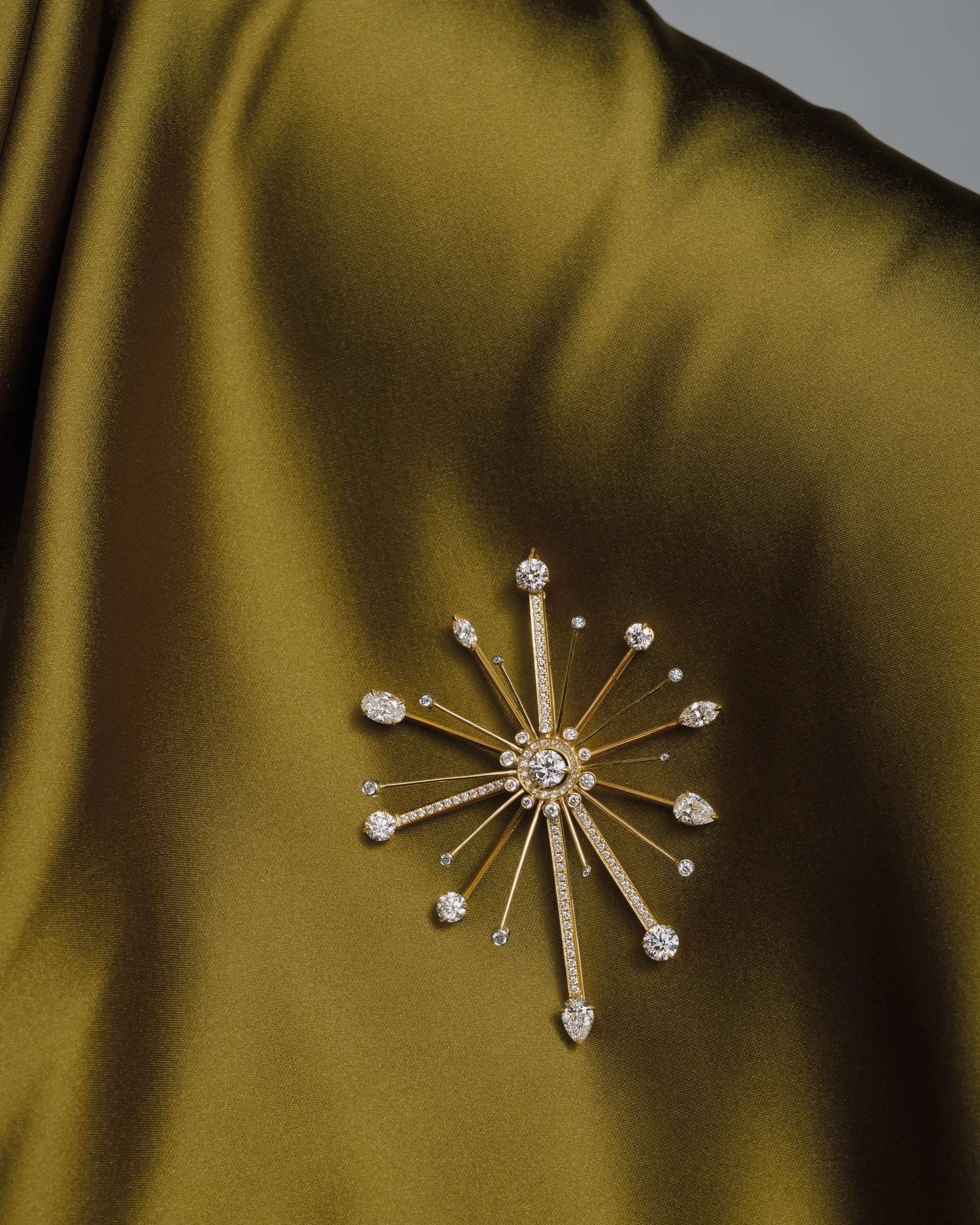

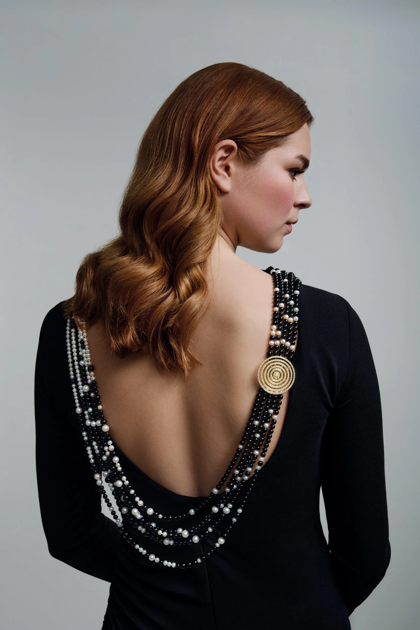
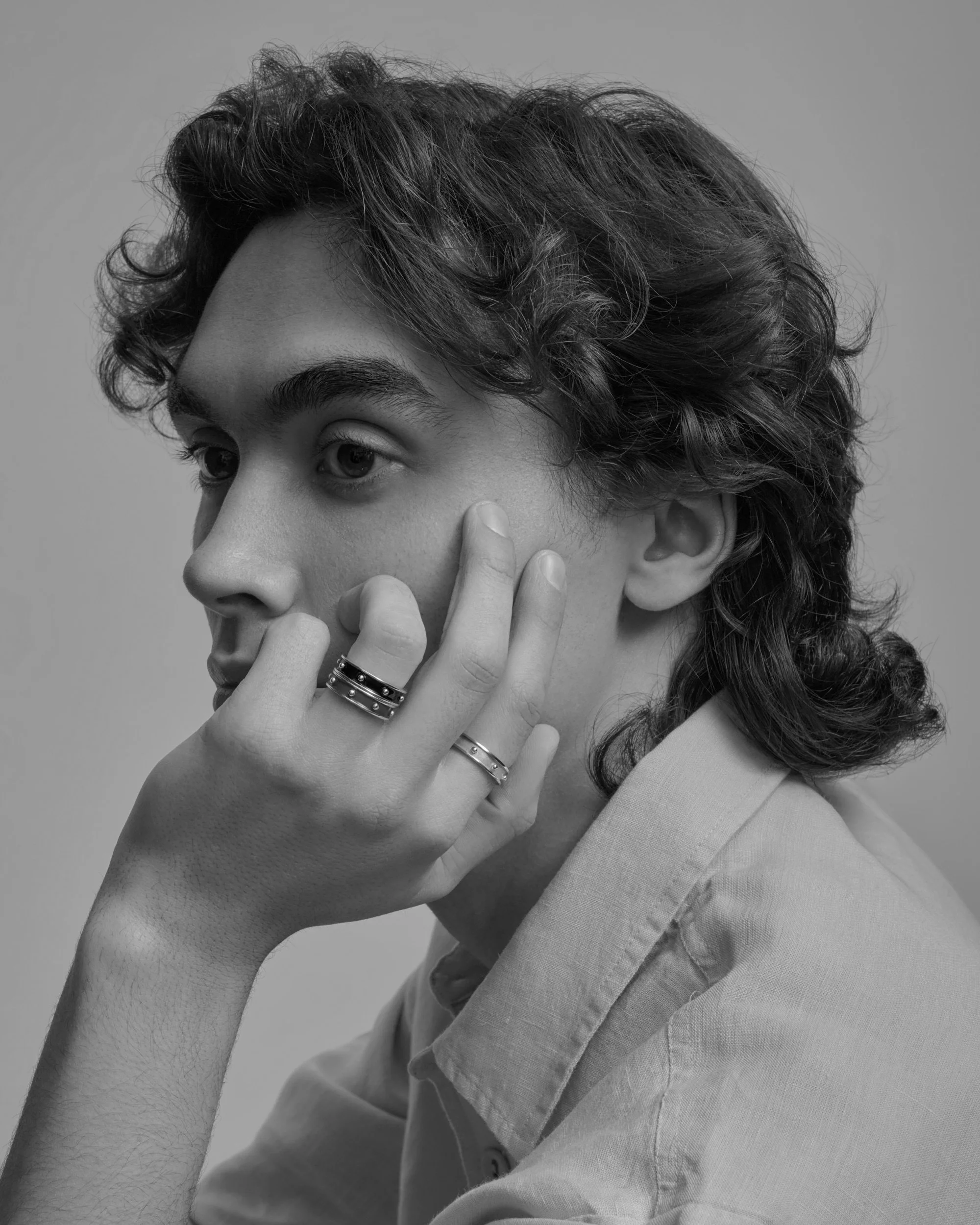
I kept hair, make-up and clothing pared back and directed a soft, high side light, with the understanding that these images had to proof cleanly across in-store signage, editorial and press ads.
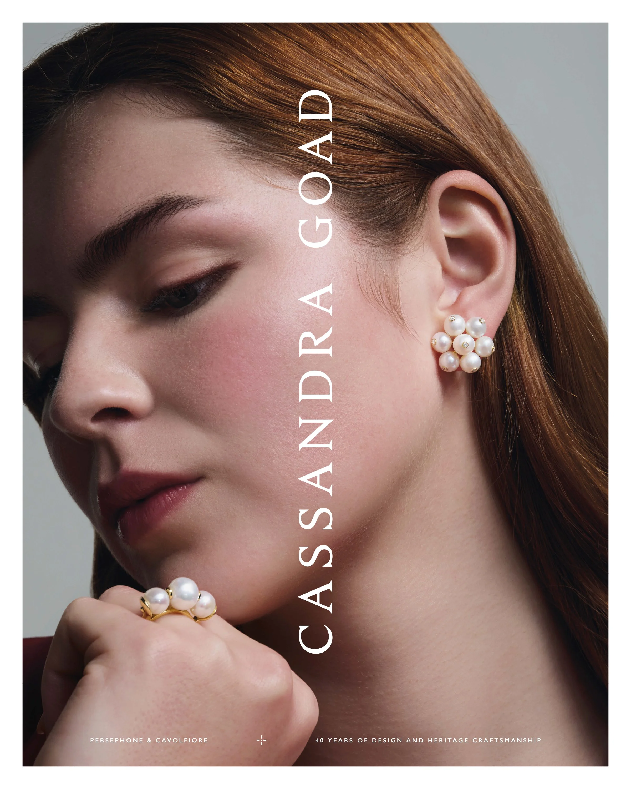
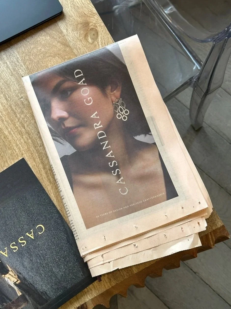
The distinctive vertical wordmark, a core part of Cassandra Goad’s brand identity, is a non-negotiable. The images needed to accommodate this when adverts were printed in local and international publications such as WSJ Magazine, Country Life, and, seen here, HTSI and Financial Times.
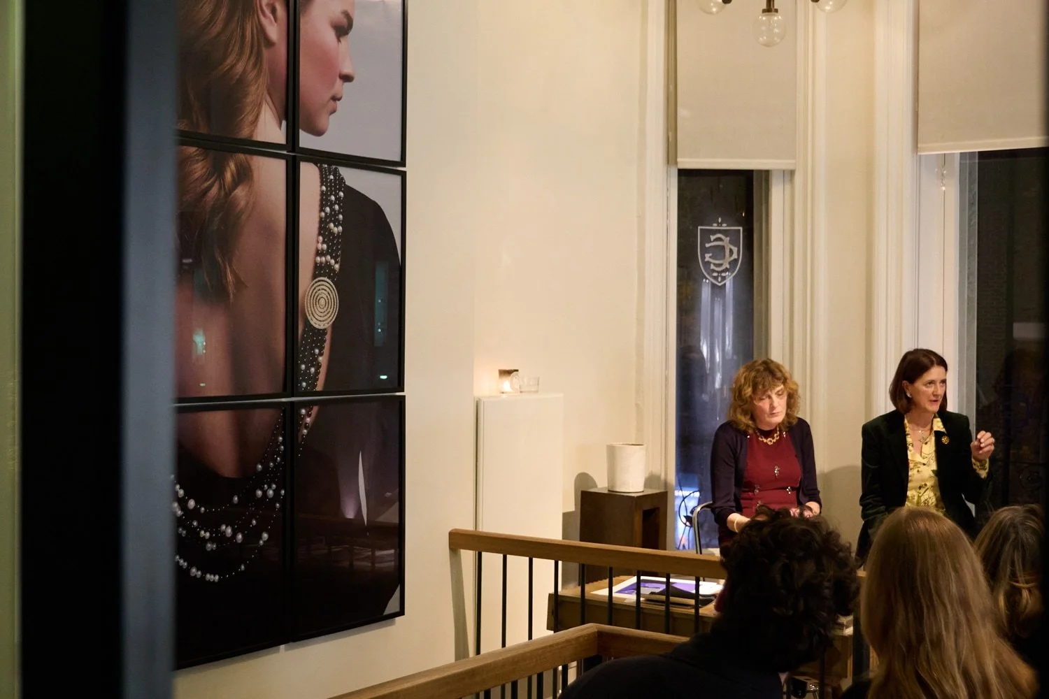
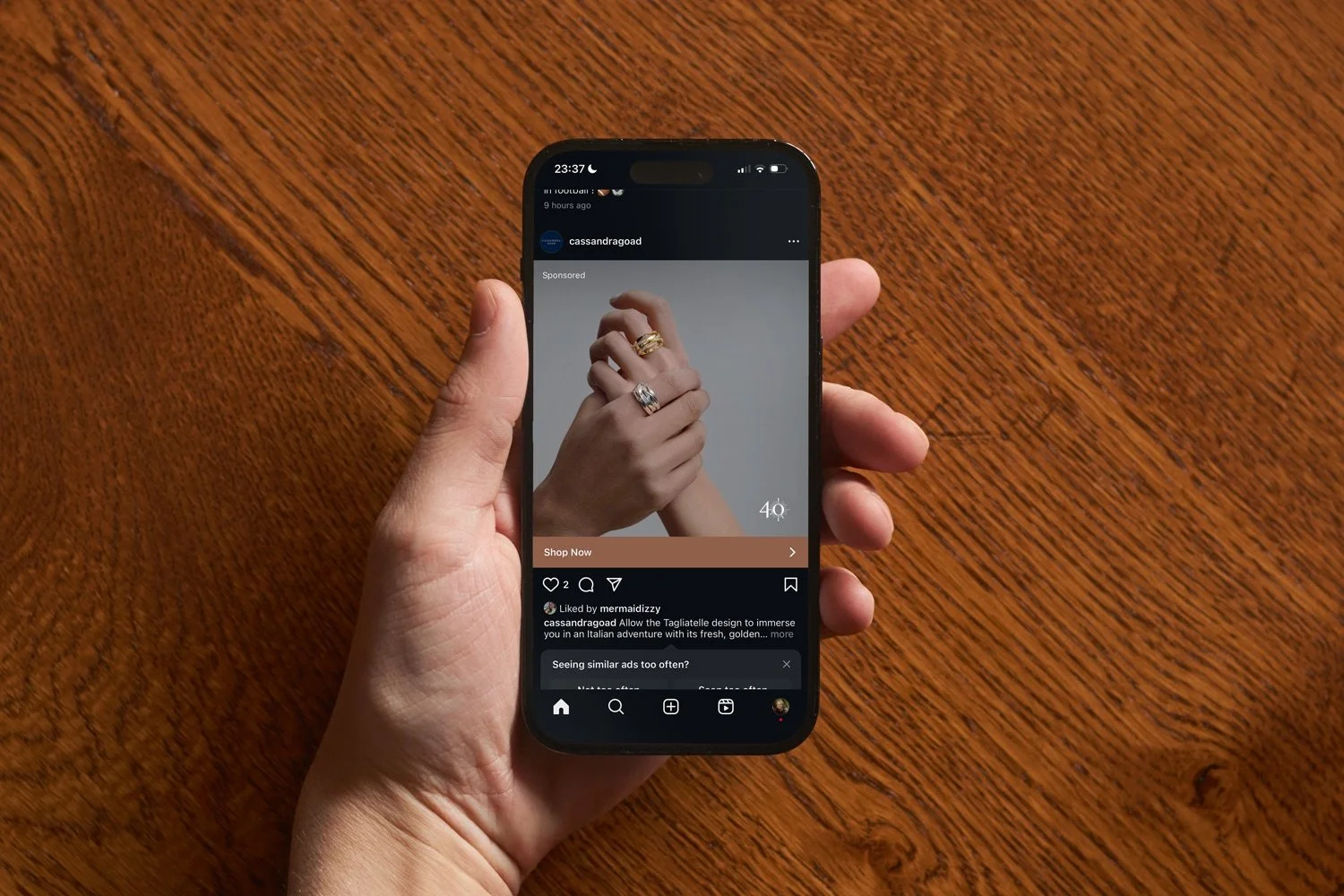

The images were easily adaptable for smaller formats, with the soft grey backdrop making images easy to extend beyond their original borders when needed. Just as the images could scale down, they also worked in large-scale displays, seen here in a grid positioned behind speakers during Cassandra’s autumn talks series.
Logo identity built from two designs which mark the evolution of Cassandra Goad
I drew two marks. The first is a silhouette of Temple of Heaven, Cassandra’s best-known design. The second came from an idea by one of the founder’s contacts. Here I focused on the ‘en tremblant’ section of the Firework brooch, which I then adapted into the speckled artwork used on the cover of the 2026 catalogue.

Temple of Heaven
Taken from the silhouette of Cassandra’s iconic design of the same name. For blind deboss and foil.

Firework
Derived from the ‘en tremblant’ brooch section of Cassandra’s masterpiece. For digital, print and foil.
Producing the annual catalogue and a 40 Years VIP booklet
Designing a booklet sent only to the brand’s VIP clients, with materials and quality to support that positioning, during a year which celebrated both the forty-year milestone and the launch of Greco, Cassandra’s latest collection, required a pragmatic approach to budgets and materials.
I spent a long time sourcing stocks that held the quality without the premium. Specifying a custom-sized Munken sheet for the text pages let me merge the booklet into the larger, 4,100-copy catalogue order. I also reduced the number of processes applied to the covers of both productions, putting the budget instead into Cassandra Goad’s champagne-hued foil.
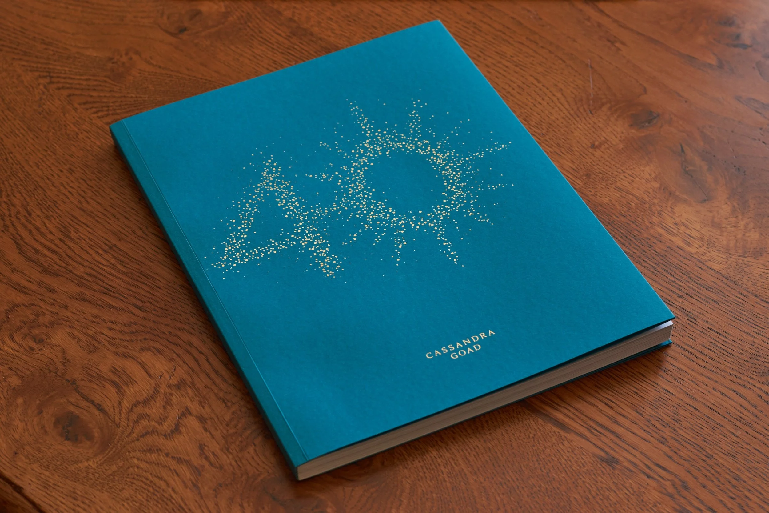
Catalogue 2026: print, 210mm by 270mm. Cover: Keaykolour Atoll 300gsm, 8pp, French flaps. Text: Munken Polar Smooth Crisp White 150gsm, 128pp, with 2pp Transclear White 150gsm insert.
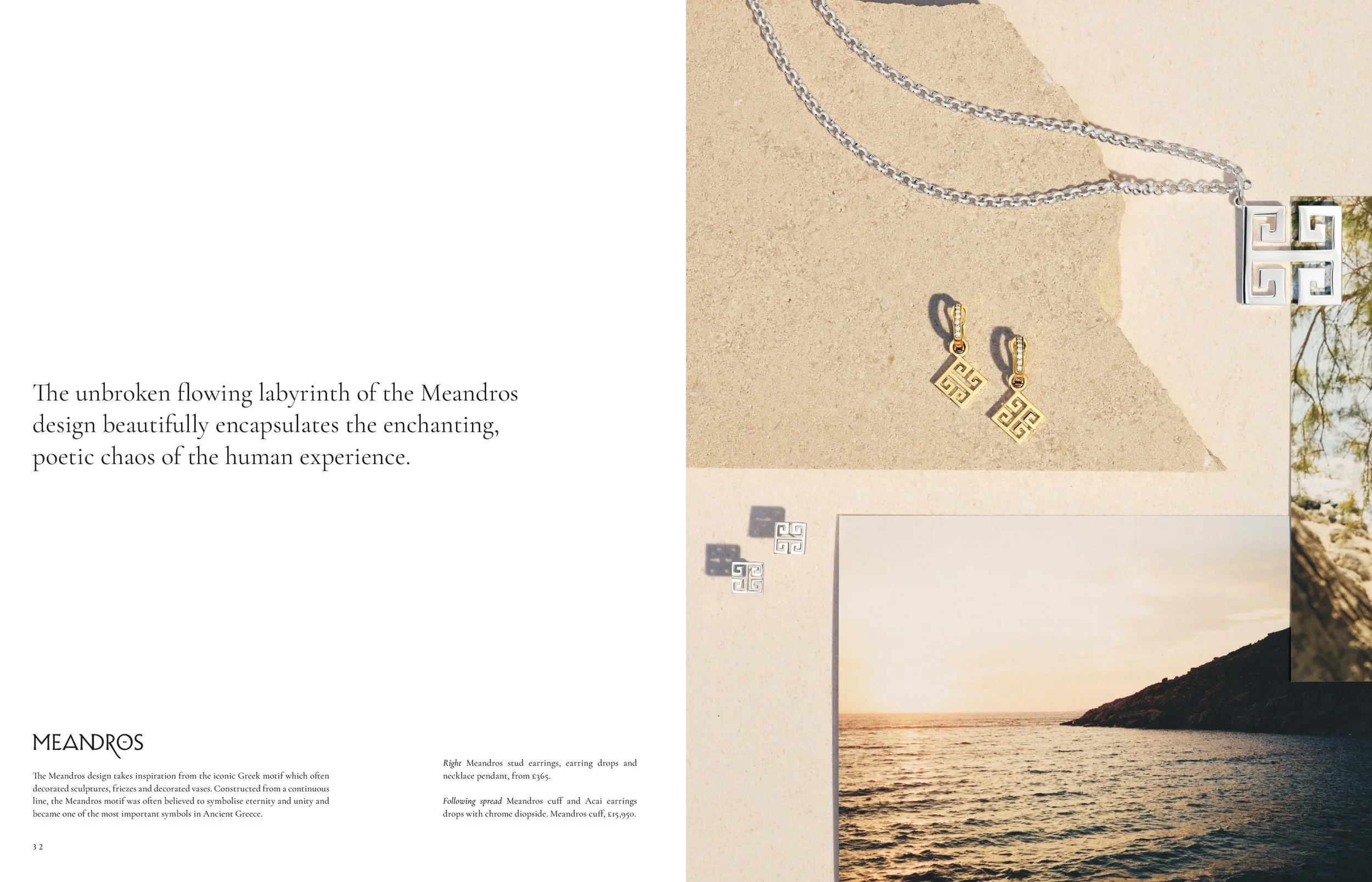
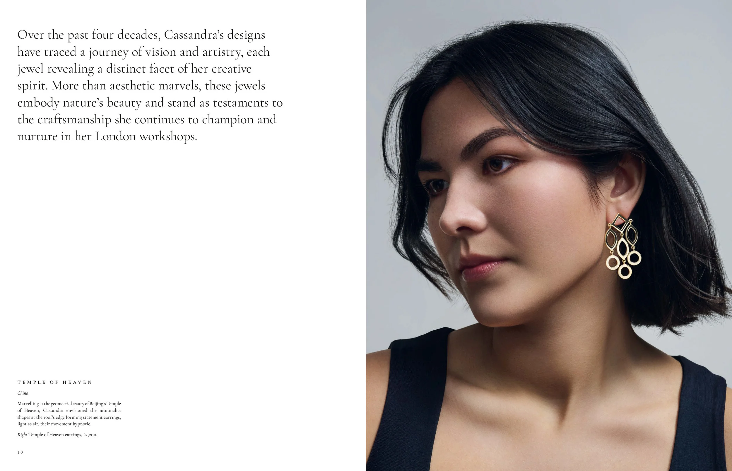
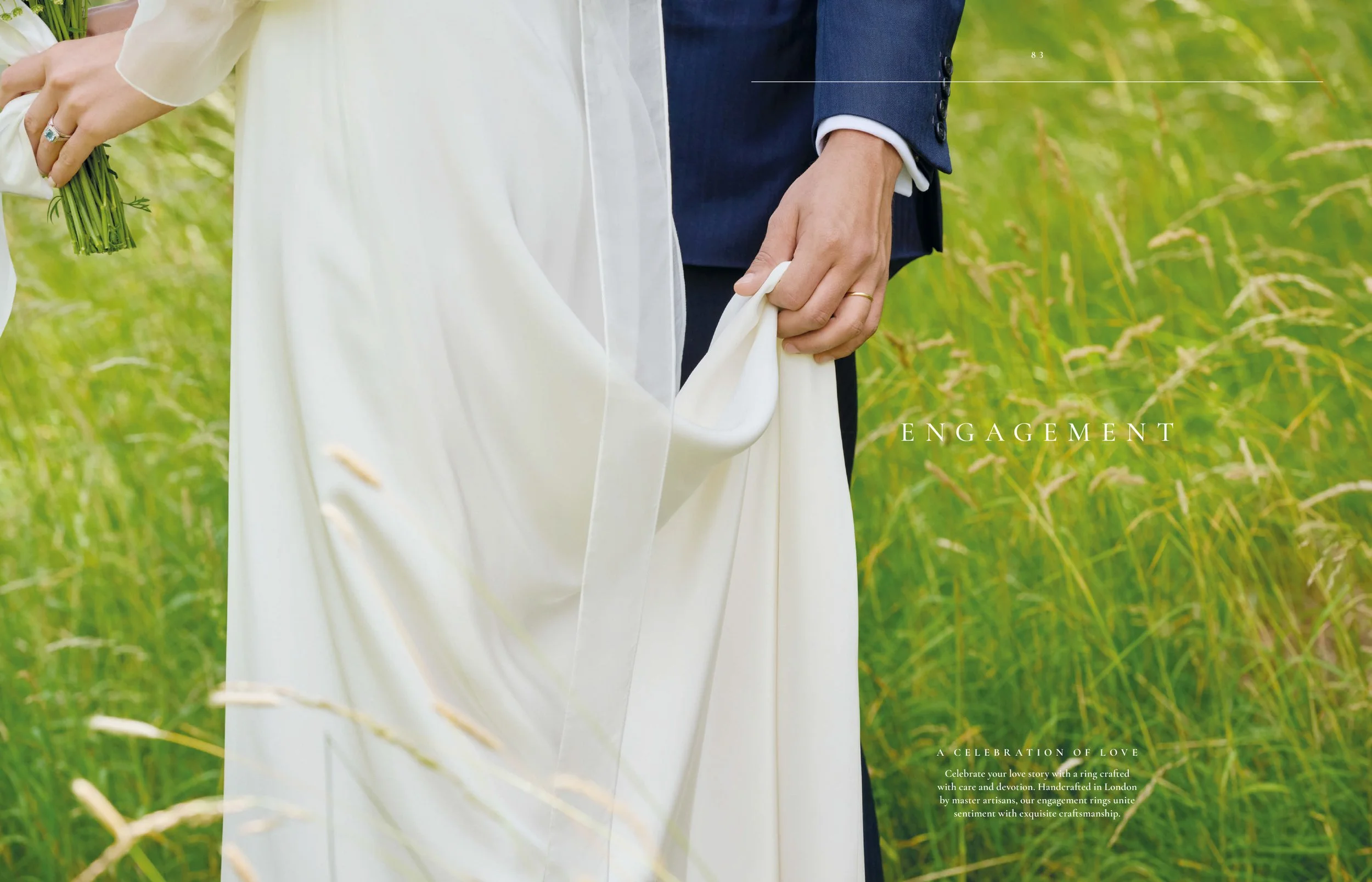
Selected Spreads from Catalogue 2026: Greco Meandros (p32-33), Temple of Heaven (10-11), Engagement title (p82-83).
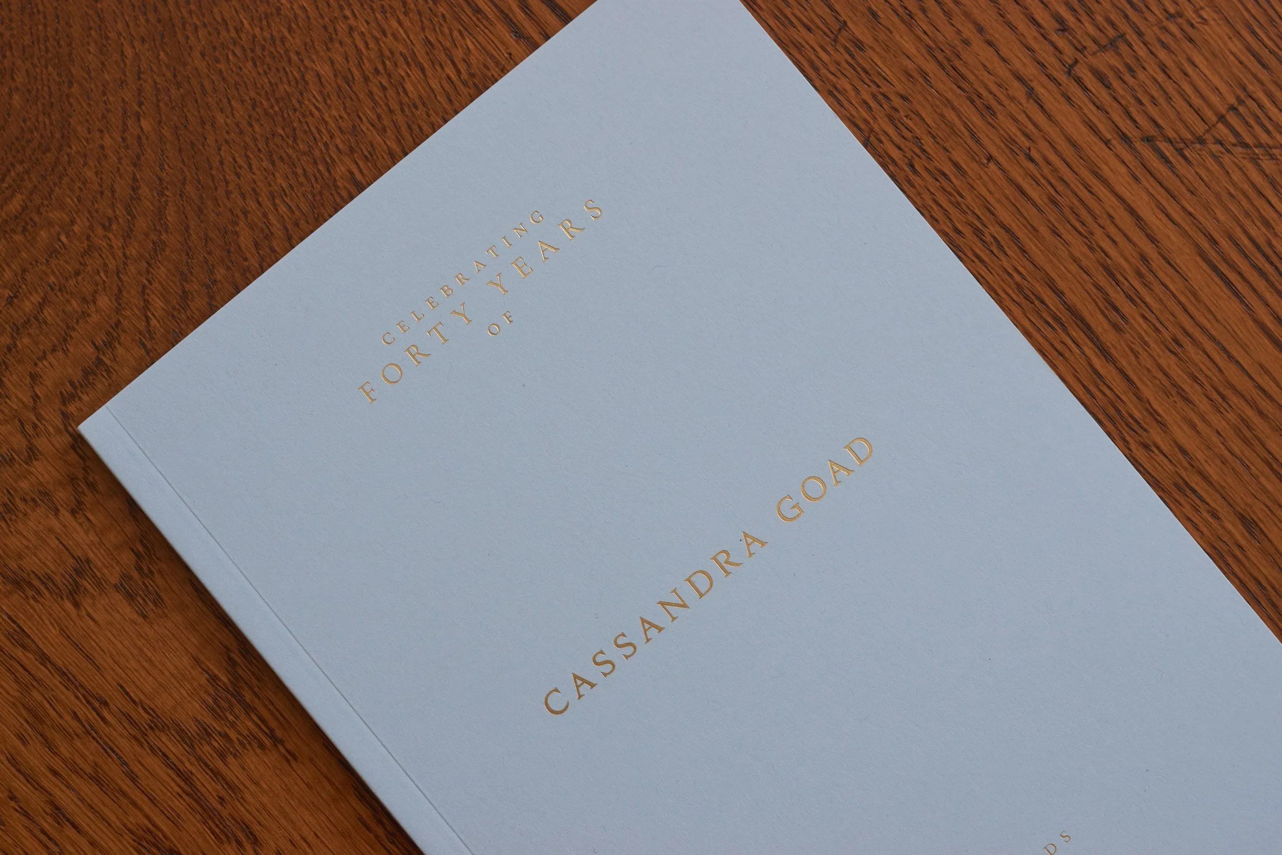
VIP booklet: print, 148mm by 210mm. Cover: Olin Baby Blue 240gsm, 4pp. Text: Munken Polar Smooth Crisp White 150gsm, 32pp.
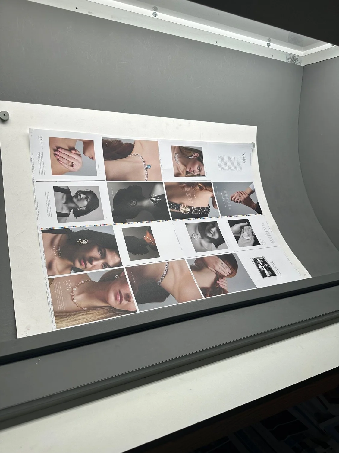
Every image goes to an external retoucher first, then, during the in-house Epson proofing stage, I continue to refine the images (skin and blemish work, composition, colour balance, exposure, sharpening). Because I’d kept the light soft and consistent on set, the fixes on skin transitions were repeatable frame to frame, and came out as expected when attending press.
A legacy from 1985 onwards...
VIP clients were invited for a large-scale celebration at Grade I listed Goldsmiths’ Hall. Each received a heavyweight invite I designed in Cassandra Goad’s signature navy and gold.
Together with the head of marketing, I curated archive rooms and jewellery displays featuring previously unseen inspirations, sketches and design notes, as well as directing a food and drink concept which took from the countries that inspired Cassandra’s most formative designs.
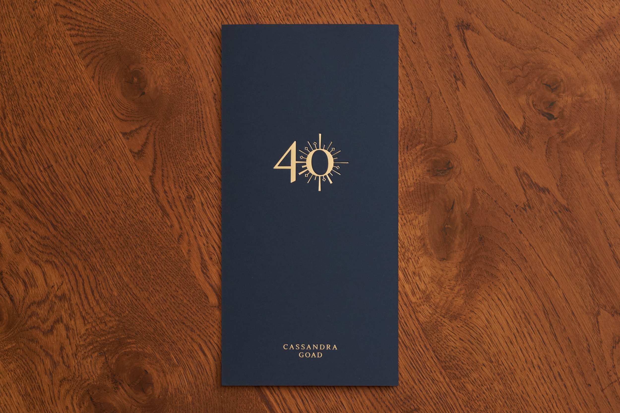
40 Years Goldsmiths’ Hall Party Invite: print, 145mm by 295mm. Olin Brilliant White 320gsm and Olin Cobalt 320gsm, quadplexed to 1280gsm, blind deboss, gold Luxor 429 foil, black gloss foil.
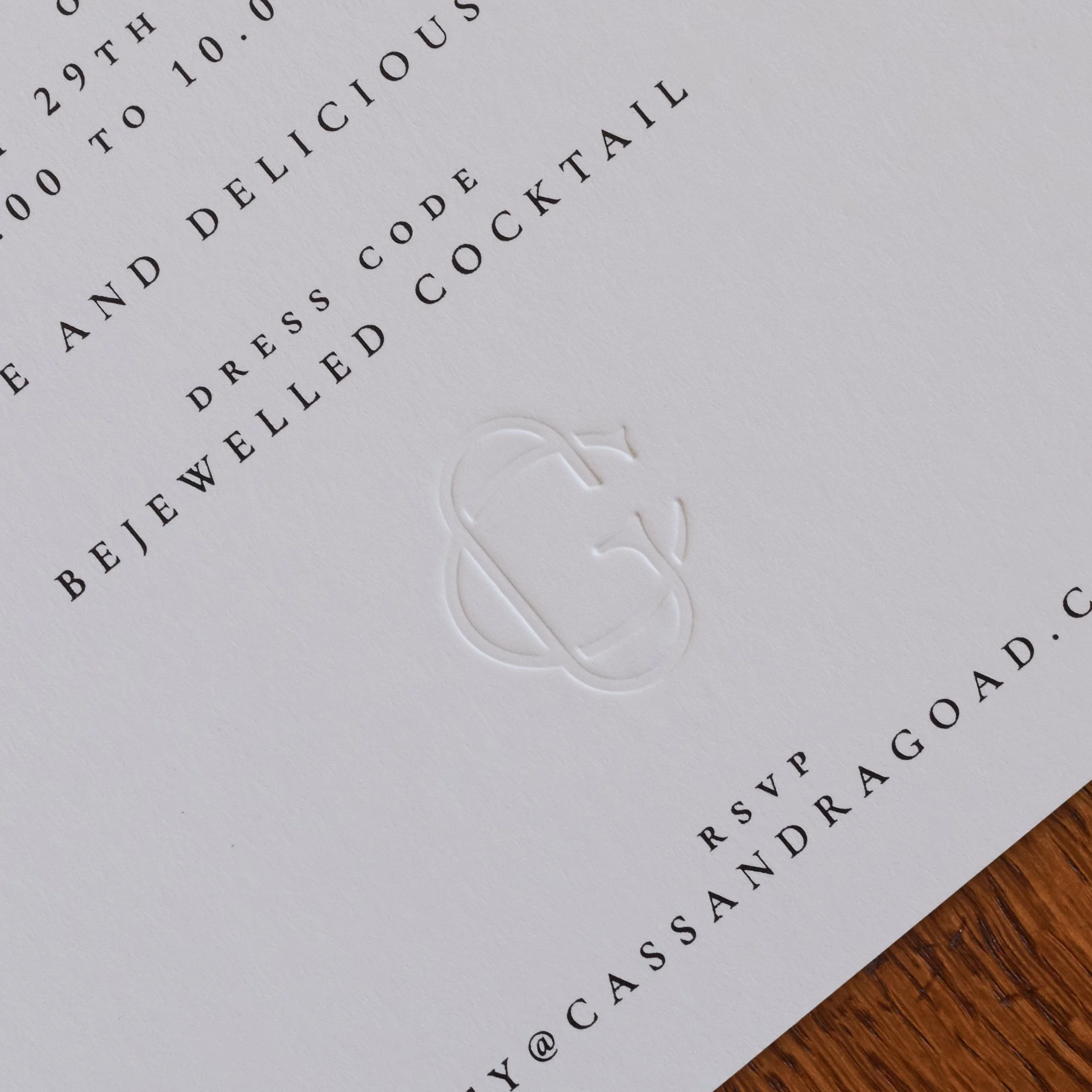
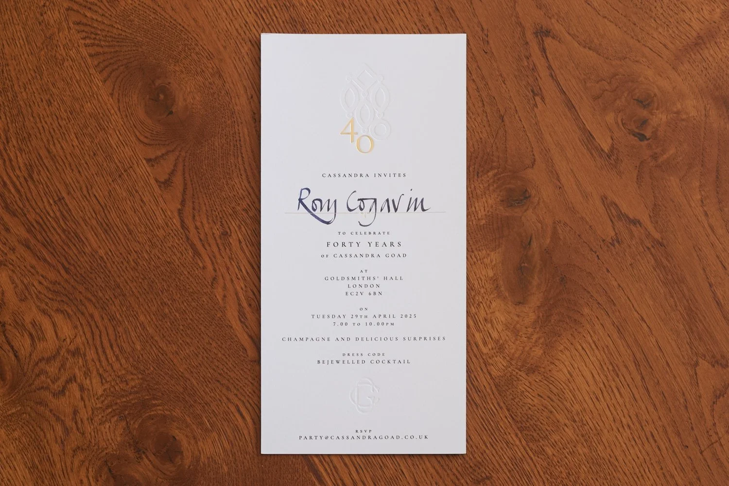
On the reverse, all invitations were hand-addressed by the founder and featured two blind deboss details, including a subtle ‘CG’ monogram near the base.
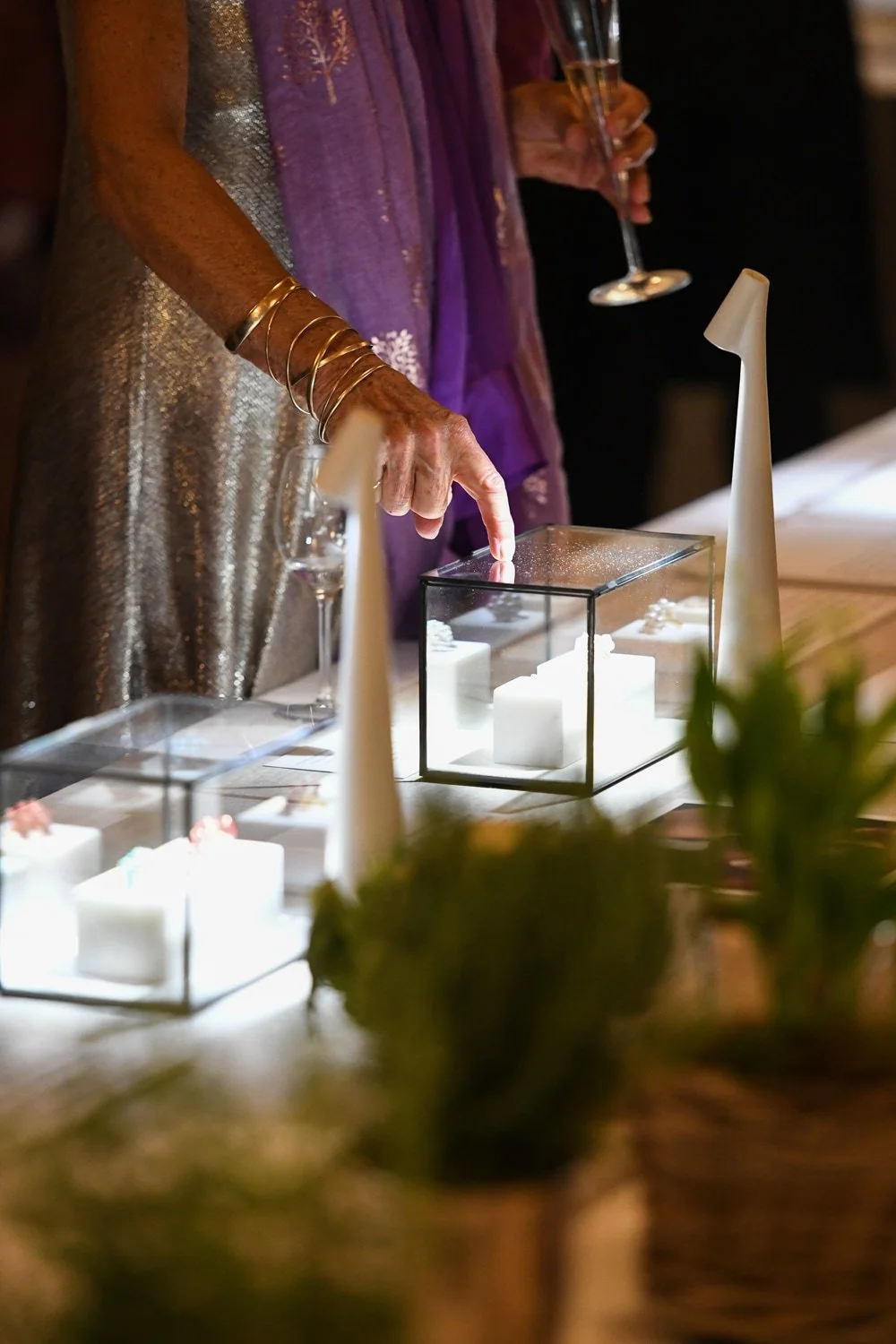
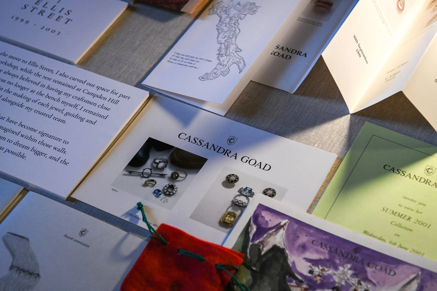
I curated jewellery, sketches, designs and archive material dating back to 1985 to display throughout Goldsmiths’ prestigious Livery Hall.
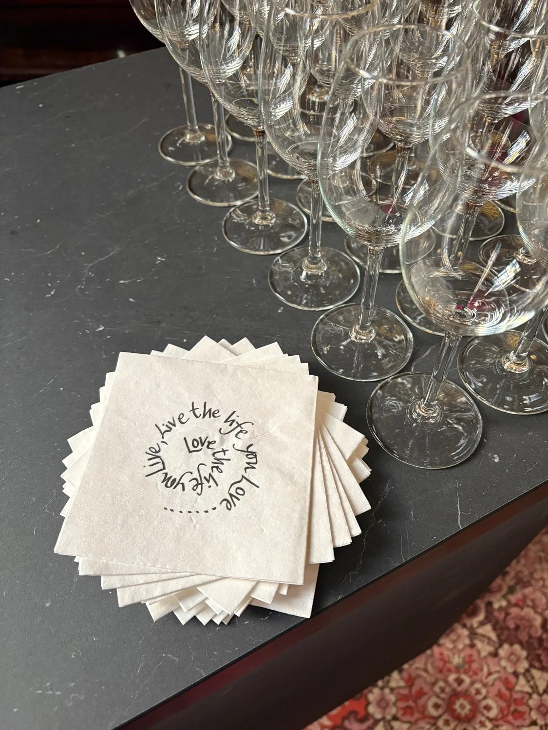
Traditionally hand engraved, this time in print. I designed and produced twelve unique napkins which featuring Cassandra’s own handwriting, taken from her Quote pendant design.